Hi!
Here are a couple of UI/UX improvement suggestions that you might consider:
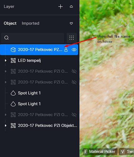
**Add tooltips on hover **
It’s often difficult to se the full name of the object becaue side bars are quite narrow and not resizable. It would be very handy to have tooltip with full file names show up on mouse hover wherever possible…
- Also when importing/replacing object dialog it’s not always possible to see which object is to be replaced because dialog is too small and filename is not visible.
Add option to resize sidebars
- similar as previous request it would sometimes be useful to be able to widen the side toolbars
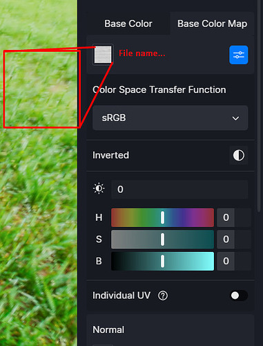
Show bigger image of texture
It’s diffucult to see what texture is being used on material
- Please allow for bigger images of textures - either on mouse hover or in interface. At least 128x128 px, but 256x256 is preffered.
- Show file path to the texture (either on mose hover or with addition to the in interface)
**Reset color modifications on images/textures"
Double click on slider to reset slider to default. Or add right click context menu to slider. This would allow you to perhaps also add presets to context menu.
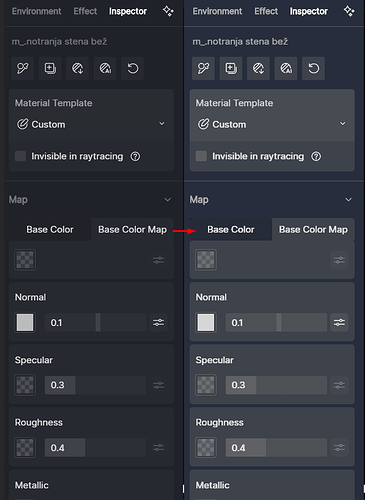
**Make UI sections more distinct **
Add stronger contrast to active tabs and between sections so it’s easier to navigate around interface


