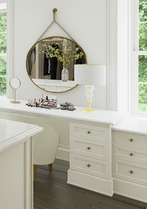
I have noticed in recent versions of D5 that there is a luminous quality to interiors that wasn’t in earlier versions. That is very apparent when surfaces are close to each other like under the desk in this image. Given the flanking windows, one would expect the knee space to be dark, but it glows as if I’d put a light under the desk surface:

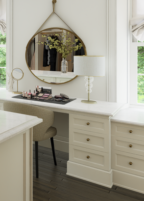
To try to fix the problem in Revit, I applied black paint to the underside of the desk surface AND to the right and left side of the knee space. It helped but one can still see light unexpectedly bounce on top of the baseboard. This will have to be darkened manually in post production:

More luminous interiors are fine, but areas that should be in shadow should not glow. Glowing niches that one would expect to be dark make interior renderings look uncanny/fake.
I am hoping the D5 team can start addressing this issue.