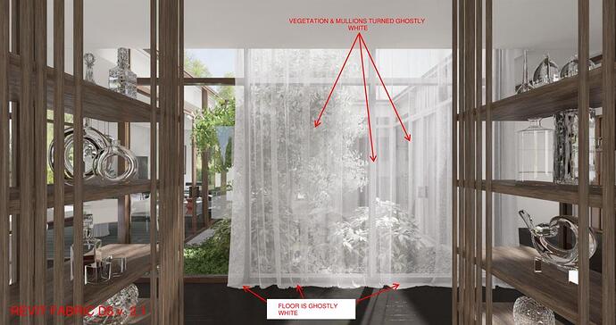
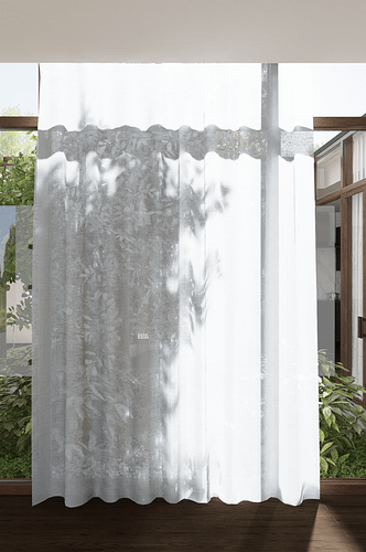
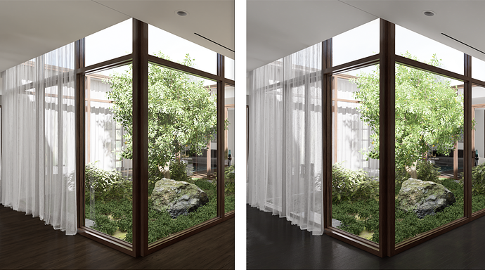
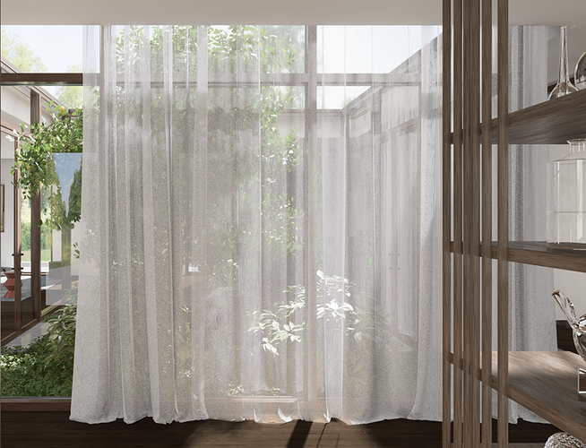
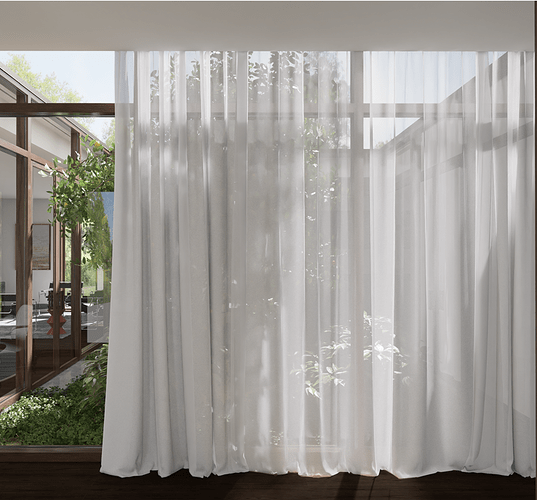
Prior to v 2.2 I had been having issues with sheer curtains. The scene beyond the curtains would look like everything had turned white whether I used a D5 material or one from Revit:
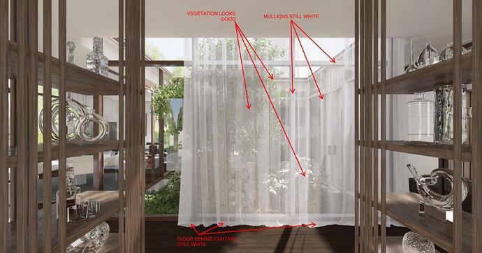
With the release of 2.2 certain items like the vegetation do look much better but items directly behind the curtains still look ghostly white. I think it’s a reflectance issue since the floor and the window mullions do have reflectivity:
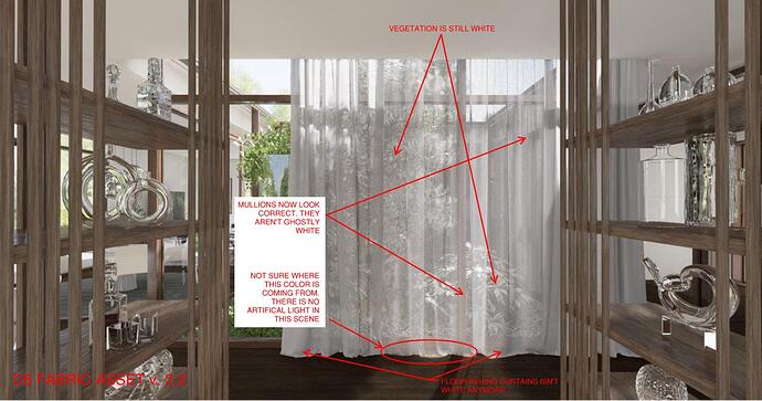
When I used a D5 material asset, the mullions and floor are no longer ghostly white BUT the vegetation is still a whitish color so I think this looks pretty bad. I also noticed an odd light patch a the bottom of the curtain as if an interior light were present but there isn’t one.
Is the D5 Render team still working on sheer curtains and how they render?
2 Likes
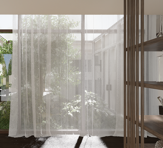
If the D5 Render team can get the colors and sunlight to look mostly like this pre render image, I’d be happy:
I tried using a D5 Render asset curtain in version 2.2 and it looks really bad:
Hi, in the coming 2.2.1, we optimized some settings related to cloth and glass materials, so it will look better for objects behind curtains and glass.
In 2.3 or 2.4, we will introduce a new GI, and we will optimize those details you mentioned as well.
By the way, the effects behind them are also related to the materials and the maps of the curtains and glass, so the effect depends.
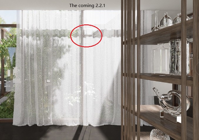
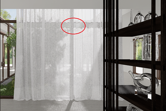
Oliver, thank you and your team for continuing to work on this issue. It does seem better. The tree shadow is projecting onto the sheer curtain and the shadow from the window frame is producing a darkness on the curtain that allows what is beyond to appear a bit more clearly than the background behind the lighter parts of the curtain. I’m not sure why the shadow cuts off like it does (red oval). In earlier studies I made, the shadow is continuous since it is caused by the horizontal mullion (second image).

(second image is before rendering)
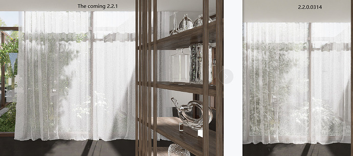
Curtains are definitely getting better in v 2.2.1:
New version on left, old version on right. Tree looks better too.
This is much better in terms of realism:
Note sure why the floor glows slightly orange at center. This is a Revit mesh.
And this image is using D5 Renders White Gauze Curtain3 at 0 opacity:
If the opacity could be 50% less that might be nice to match what I could achieve with my Revit mesh. The D5 asset is still a bit too opaque for a truly sheer fabric.
Hi Jeffrey, thanks for the updates. We will keep improving the effects. Let’s wait for our new GI. 
