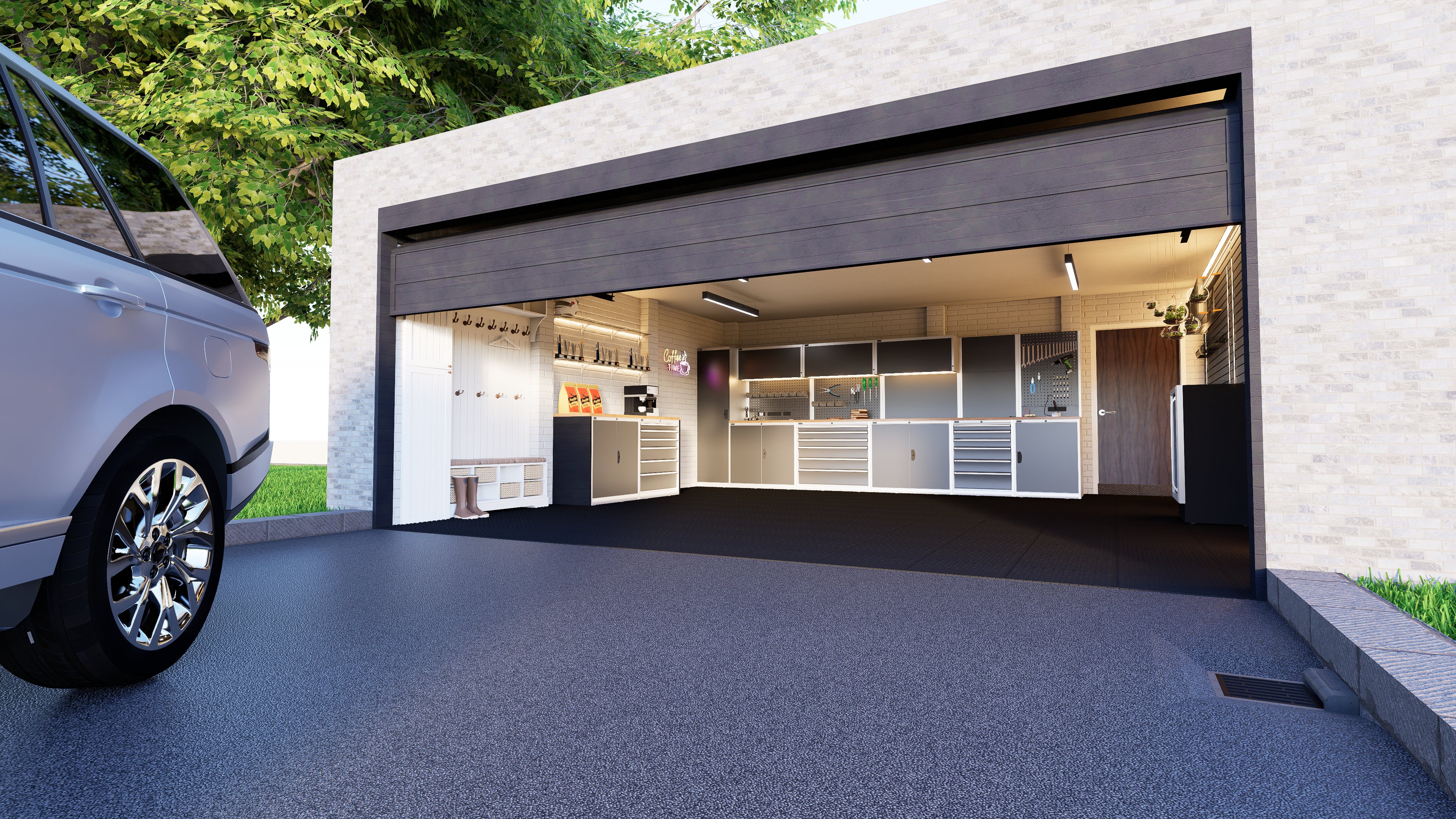
Theme: garage Artist: Me Graphics Card: RTX 4070 Workflow: Sketchup + D5 Brief description of post-processing: None used Whether the model is original: yes
Description of the work:
wanted to mess with render lighting and trying to just get a nice render without speed being the priority, Any feedback is appreciated!! Only been doing renders/3D modeling for around 5 months,
It’s quite good for having only 5 months of experience. The lighting looks fairly solid, although some materials feel slightly oversaturated, which can give an artificial look — especially the grass and the asphalt at the garage entrance.
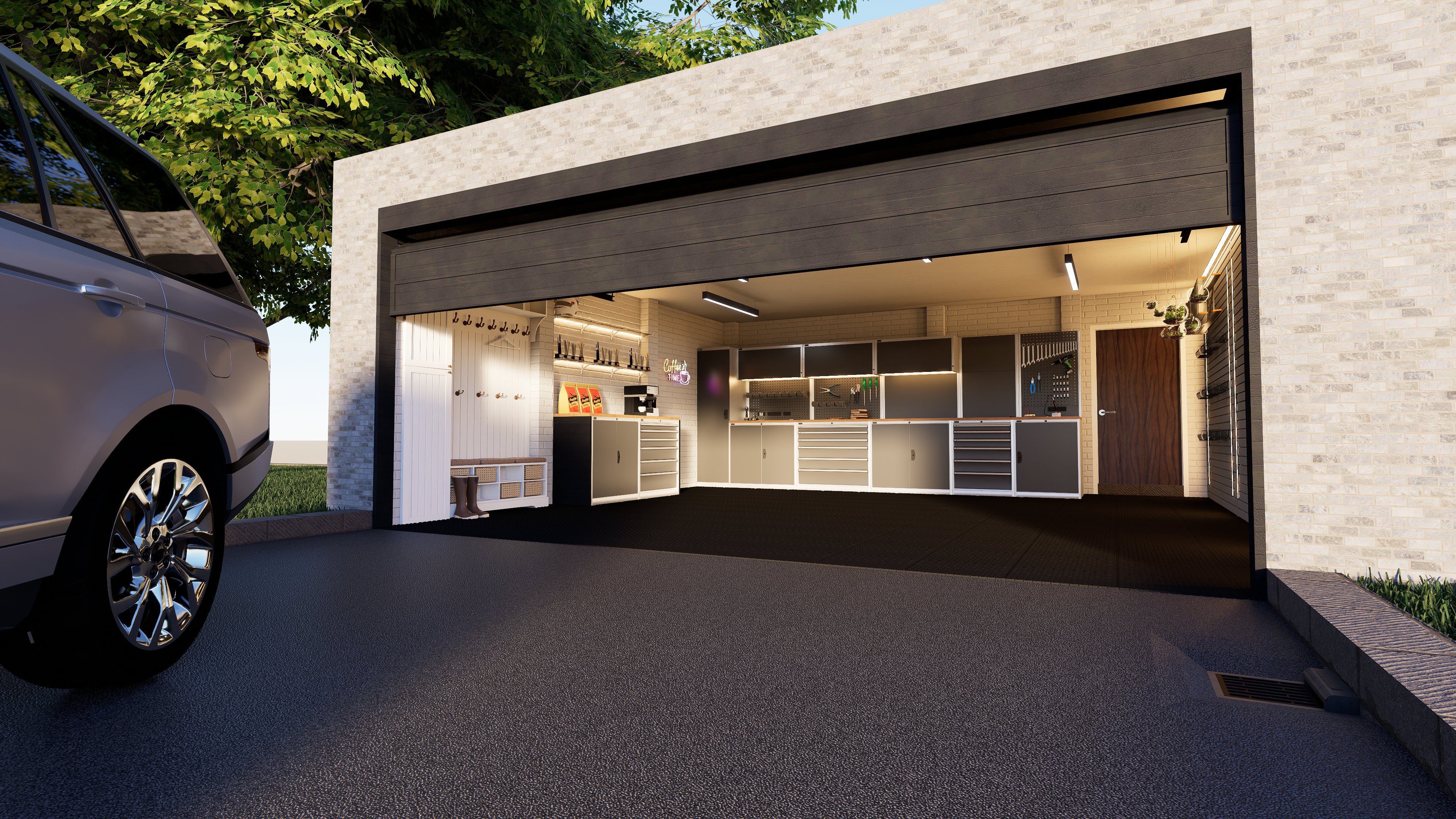
I’d say the first thing to improve would be the framing of the render. Right now, about a third of the image is taken up by that asphalt, and the “architectural element” is pushed toward the upper edge of the frame. I think a frontal view of the space, closer, more centered, without the vehicle, could be more interesting.
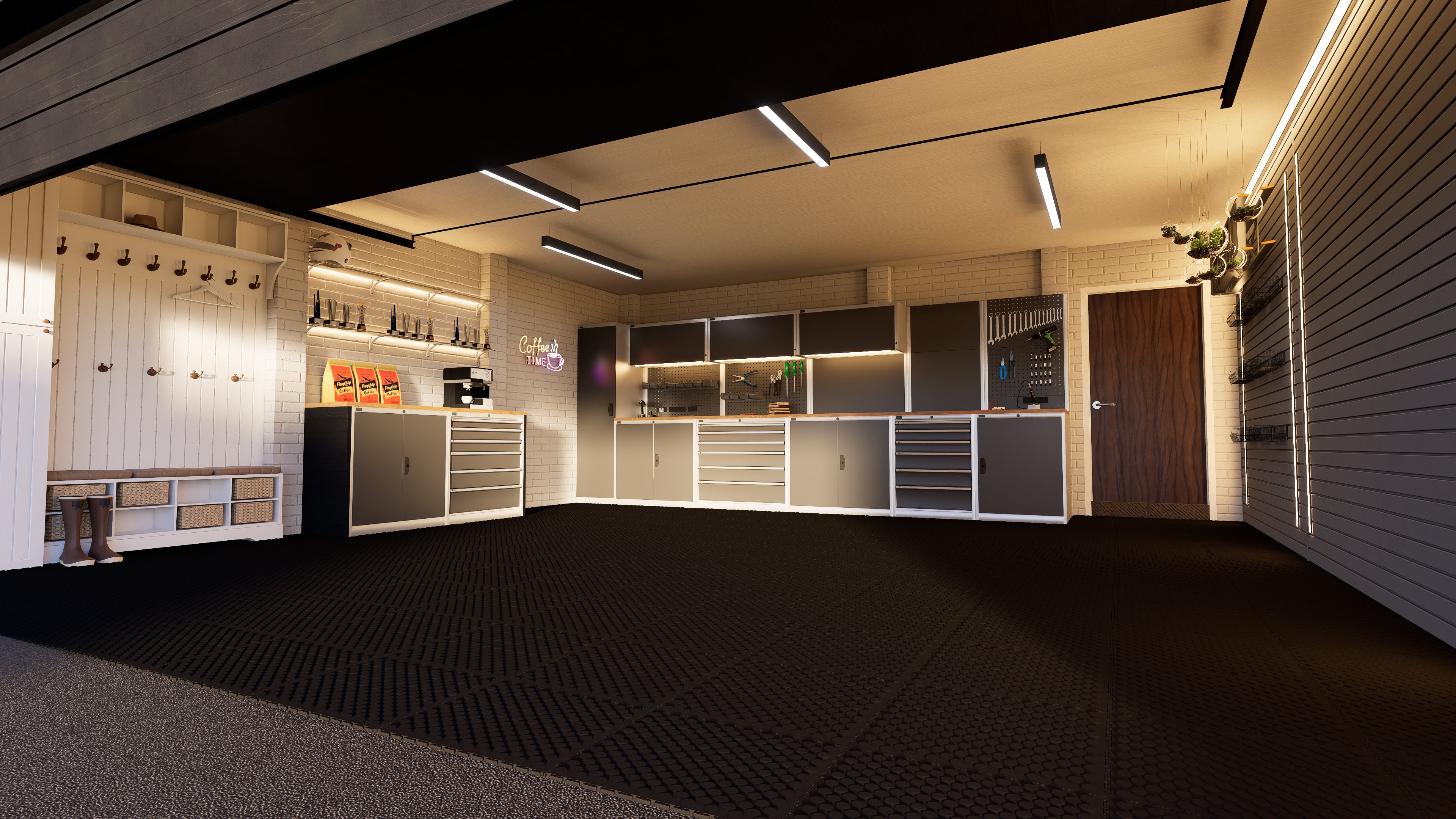
Alternatively, a perspective similar to the current one but closer, without the vehicle, allowing more detail of all the interior elements to be visible. Or, if you want to keep the vehicle, move the camera back and show it fully, so its scale in relation to the garage and the surroundings is clear. Right now it doesn’t have the prominence it deserves — it’s just taking up space.
That’s what comes to mind at first — hope it helps!
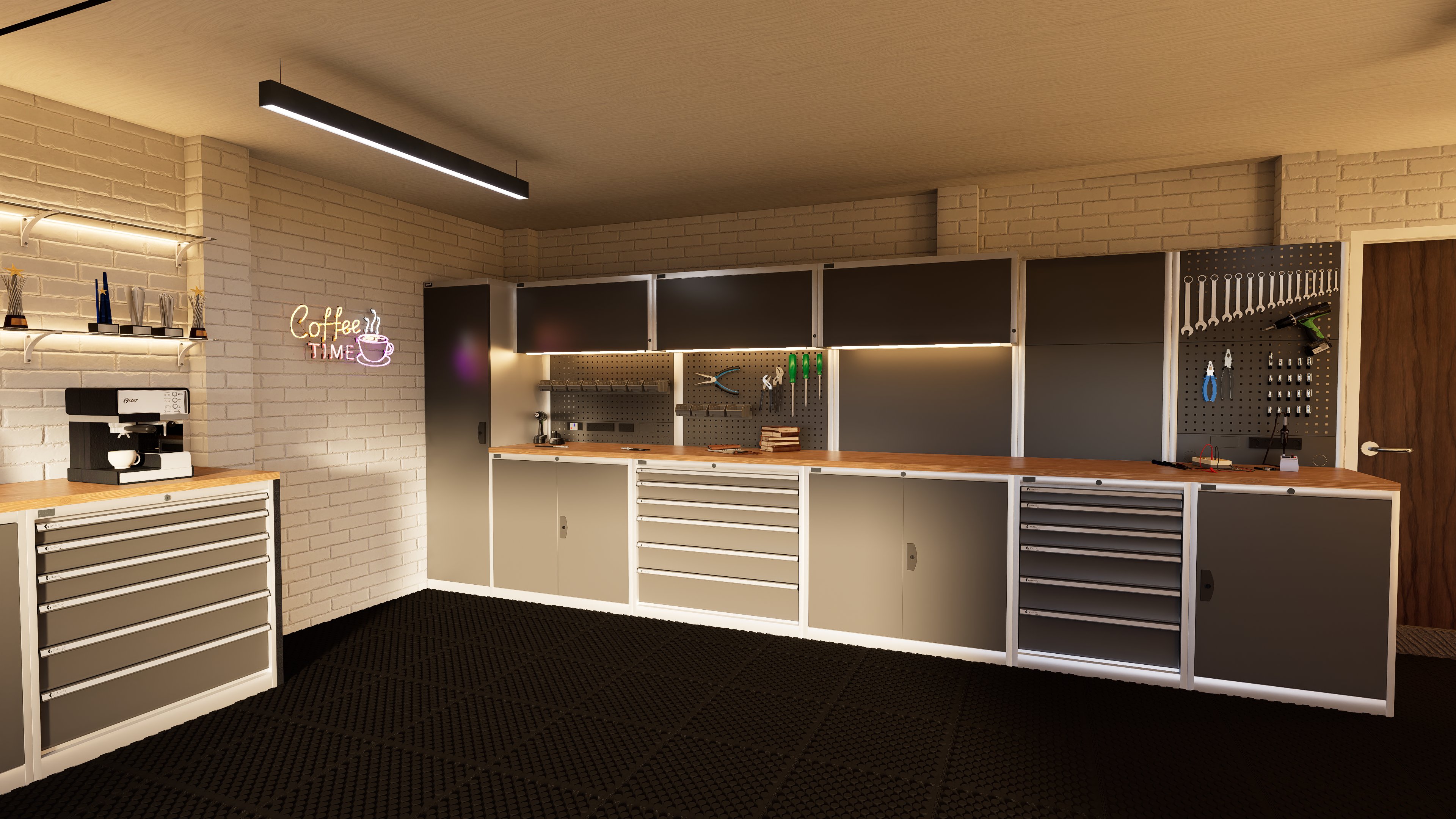
being self taught I tend to shy away from sliders I’m not sure the result of,
however seeing the difference between high saturation and low saturation made a world of difference (aswell as turning the sky background light away from 250 and down to match my sunlight intensity)
I took into account what you said about perspective too, I don’t have the rest of the building modeled so i Didn’t include the whole car and kept the back bit of the car in the scene as it hides the never ending void.