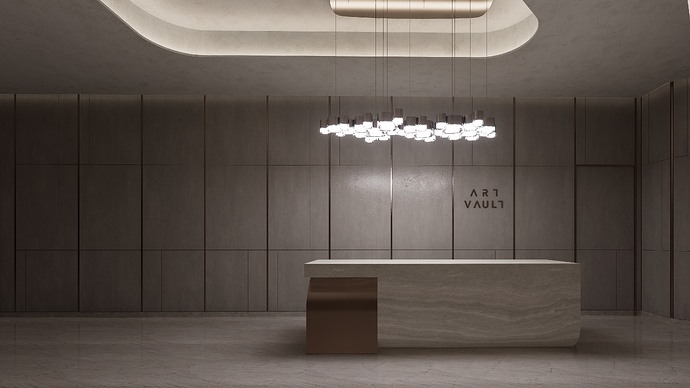
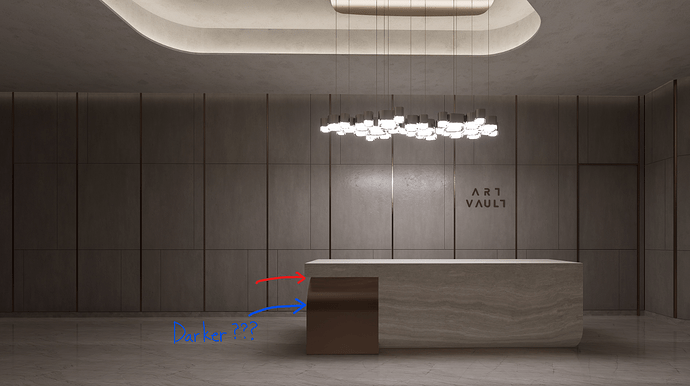
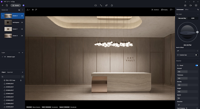
The one on the left is an image rendered with D5, and the one on the right is an image rendered with another renderer. You can see a clear difference in shadow expression, D5 showing very awkward shadow expression on materials with low roughness such as metal or marble. I think this part needs improvement.
i can see left d5 image is more exposed and right image lighting is low than left image. lower intensity of light above table. u can render AO channel to improve in post.
This image is shown as an example only. I tried changing the light settings in various ways and checked the results. No matter how I change the intensity of light and options, the unnatural shadows remain the same. This is not a problem of intensity of light. The problem is that the shadow is not cast properly where it should be.
hmm, can u share this scene on wetransfer. i would like to attempt to achieve desire shadow.
And as you know, the stronger the light, the darker the shadows become. As you said, if the cause is that D5 has a stronger intensity of light, it is normal for D5’s shadow to be darker. But that’s not what we’re seeing.
here is the scene. If you have succeeded in expressing shadows properly, I would really appreciate it if you could share your method.
Hi Spencer,
tthis is an attempt I made, I changed a few things, I switched off the spotlights in the lamp above the counter and left only the light material of the lamp, switched off the two spotlights on the ceiling between the counter and the viewpoint, lowered the exposure and raised the slope to 0.9. The result doesn’t look bad to me.
Thank you for your efforts. But it’s still not the expression I want. The areas where the curve meets the plane should be shaded darker than other areas. (Like the part pointed to by the arrow in the image.) D5’s shadows feel very unnatural because they are cast uniformly on all parts.
The red arrow should be the darkest part. However, the blue part appears the darkest. This is very unnatural.
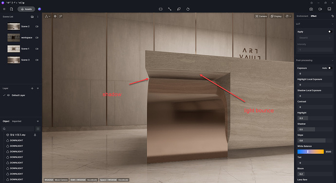
this is what i achieve, still the point u raise is valid. table is not creating shadow in that depth area.
as u see inside that area shadow can be seen, but front face area is lit up. i think light bounce is preventing that table to create hard shadow. one more thing table bottom and that curve part is having distance so its obvious to fade away shadow .
u can do one trick, make that under face poly to black, so light bounce will be less and metal part will reflect that poly as a fake shadow.
I tried to change the material around the counter, if the material is not metallic the problem disappears, at least we have defined that the anomaly only occurs with metal surfaces.
Yeah, I know. Shadow expression in highly reflective materials such as metal and marble is a problem. I wrote this article to suggest that the D5 team improve this issue.


