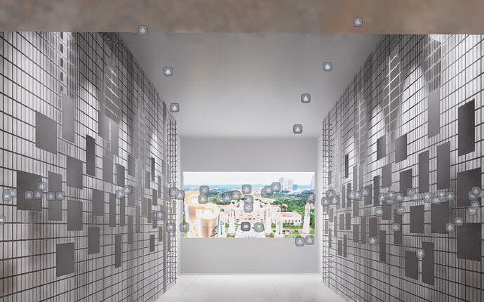
Possible to have improved light source identification and selection method? We work with a lot of interior and event scenes, currently when we want to select lights it looks like this:
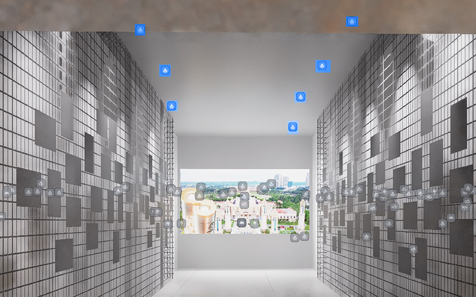
There are a lot of different light source from other rooms that clutters the UI, possible to have a toggle to on off to hide lights behind 3D object? Or a toggle to differentiate lights in front and behind of 3D object? (way more transparent or a different colour icon to differentiate them like 3ds max or lumion)
That will improve user experience. Even better if we can just “select light” that’s in viewport only without selecting lights behind 3D object, would speed up the workflow alot.
Thanks!
- showing colour differentiation, currently we have to squint our eyes to identify which lights are behind and which is at the front of 3D object because the icons are almost the same colour

