Hello,
Is it possible to tweak the default UI colors?
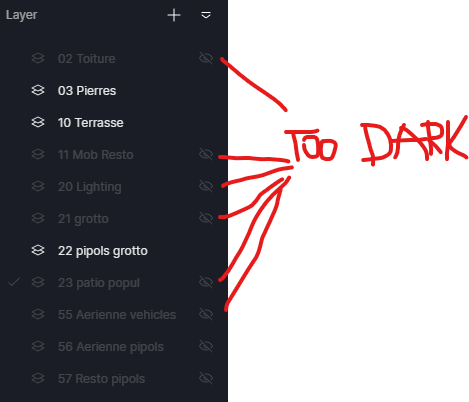
The grey value of the switched off titles is too dark and is difficult to read on the black background. Often this becomes a guessing game and it’s quickly getting annoying.
When you work on dark scenes at night it’s kind of ok but when you’re working on daylight on bright scenes, it becomes a nightmare.
