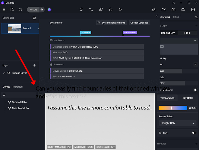
Is there an option to change the interface color scheme so that the title bars of newly opened windows are visually distinguishable from the main window? Modal windows, in particular, are especially annoying when their title bars blend in with the main or any other window. Maybe you get used to it over time, but it’s really distracting and adds extra effort when you’re just starting to get used to D5.
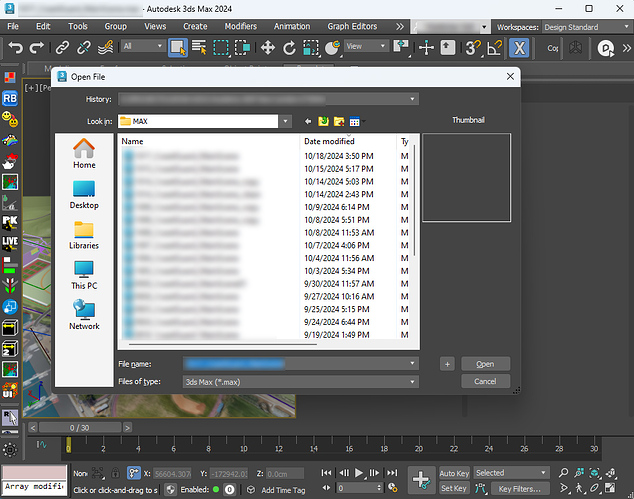
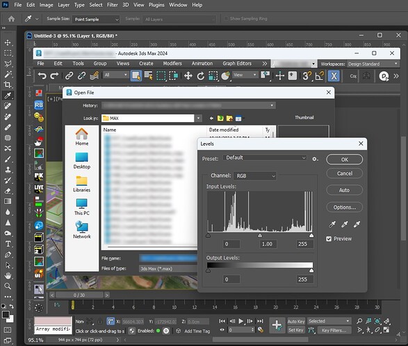
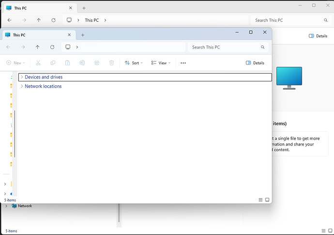
Alternatively, it could be helpful to provide users with the ability to choose between native windows and your design layout. I will attach several screenshots to show the difference in the visual design and the distinguishability of the title bar. Find the difference.
Same thing with the titles and buttons. If light from a lamp or the sun hits your monitor, it becomes difficult to tell where the button is, where the rollout is, and where the panel name is.
D5
3ds max
Photoshop
Win11


