Hello everyone, I’ve been using this amazing software since version 2.3 and I even got 2 professional licenses for my office. But sometimes we get caught up in the same concerns about the software.
I’ll make some posts on this forum adding our suggestions for improving the program.
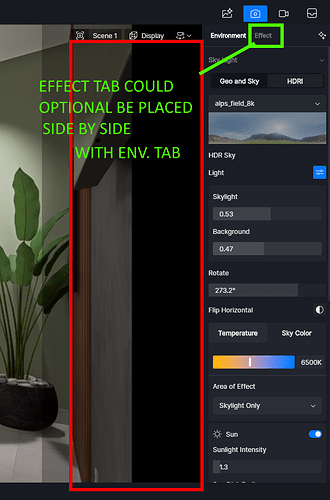
1 - We use wide-screen monitors, so we thought that the environment and effects tabs could optionally be placed side by side. It’s very tiring to have to switch tabs all the time, especially because we have to scroll back and forth to the desired option. There could even be an easy and small tab in some corner for the brushes already placed instead of having to click on a brush in the model to show said tab.
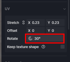
2 - Our projects don’t always follow the X and Y axes for floors and walls. That’s why we always need to rotate the textures. The texture rotation options in D5 are strange or limited. First, although we can enter angles such as 15.2° or 15.8°, the text written in the angle box is rounded to 15° or 16°, without showing decimal values. There could also be an option to fine-tune the angle precision for textures, such as 15.367° through a slider that, when pressing a button, would allow the mouse to slide slowly to the desired angle.
Another thing is, I don’t know why, but the D5 distorts the textures when rotating, it’s okay that there is a button to prevent this from happening. The X and Y axes of the image could always be defined by the orientation of the texture and not a fixed global value.
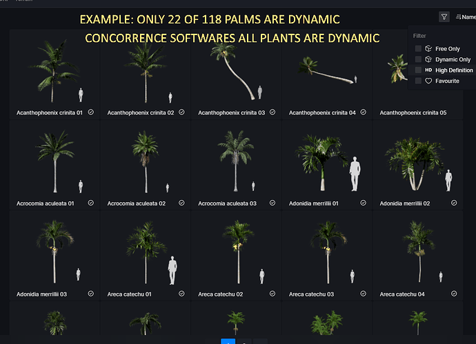
3 - Most of the vegetation is not dynamic. Which is okay if we work with photos, but it causes a strange feeling when creating videos and only part of the vegetation moves naturally. I live in a tropical country and most tropical models do not move.
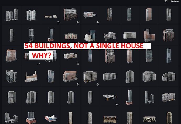
4 - Why are there no house models in D5? Not all projects are built in a large capital full of skyscrapers. We have 54 building models, but none of them are houses. This makes it very difficult to build a convincing environment in a suburb or in non-vertical neighborhoods. There was an attempt to create a disposable house made of thin planks, but not regular houses. Please, enough with the skyscrapers, there are already too many, make regular houses too.
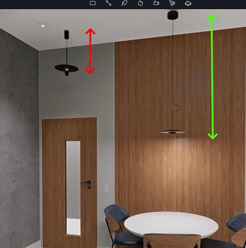
5 - For the lighting models, it would be an interesting idea if they had the option to adjust the size of the electrical wire. That way we could adjust until we have the ideal size.
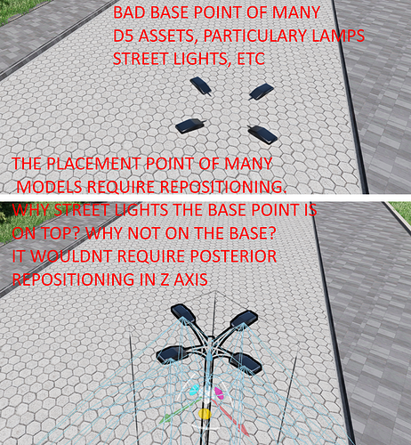
6 - Many D5 models have poorly thought out placement points. This makes it very difficult to do the “quick work” proposed by the software. Please fix this. It usually happens in assets that are groups.
I hope this helps you make D5 even more amazing than it already is.
