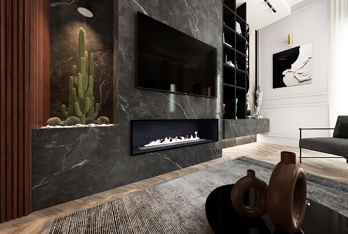
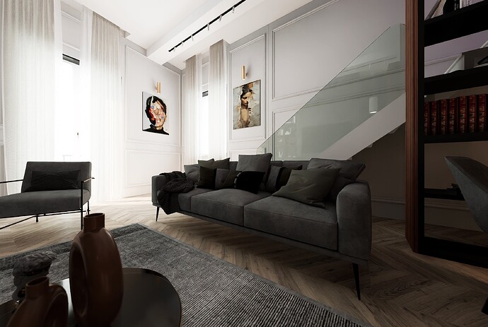
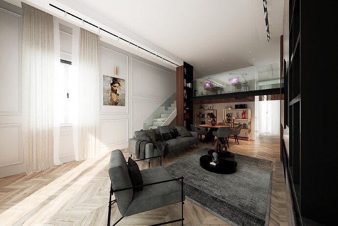
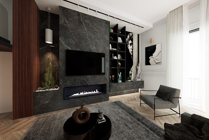
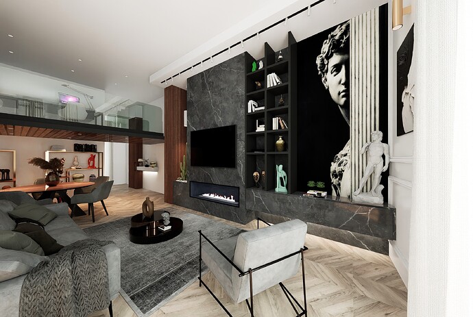
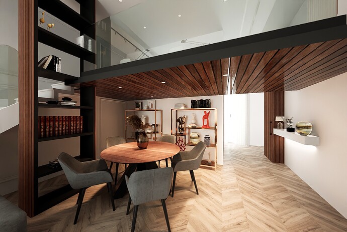
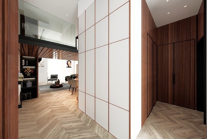
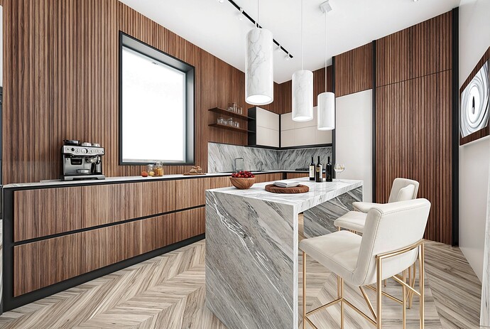
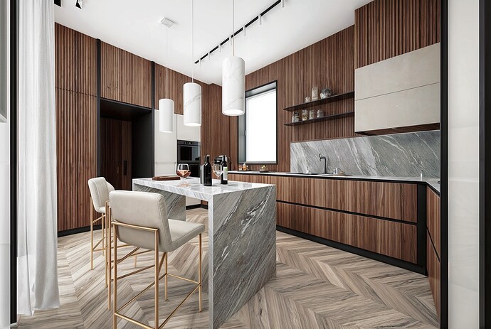
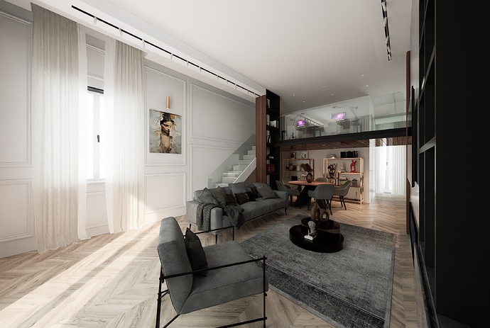
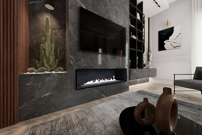
**Theme:**SCENES - LIVING ROOM - KITCHEN
Artist: DIFOCA GROUP ARCH
Graphics Card: GTX 1070 16G
Workflow: ARCHICAD - D5
hi, why camera views are look like stretched and not like normal view angles. i found light from window is over exposed. and that expose affecting shadow details. some elements are missing reflection and that affect overall realism.
Hi, Thanks for the criticism, you’re right, the 110 degree images were a choice, for the shadows the images were modified, giving a different effect. In fact, real images are more beautiful than these, but it’s always a question of taste
hi, bro i like the way u accepted my comments. as u said its intentionally created that way, than its ok. i was just trying to address issues i found to improve.
i’ll share my first project on forum, once all set.
You’re doing so great, Strength, Courage and Personality
thanks bro. im a pro Lumion user. did lot of projects on lumion. this time i thought to give shot to D5. before this i dont have rtx gpu so unable to use D5. the exterior project im working is first in D5, and i was amazed by realism and quality of D5. lumion experience helped me , both are similar in navigation and asset placing. i think im going to work on D5 from now on.
I put the image here without modifications, to give you confirmation of your criticism that the shadow is the light.
Then for the 110 degrees, the client, having a narrow but very high room, wanted to see how the furniture fit together, so this was the choice.
got it. ![]()
Sorry again, what you wrote means, being an old man, I don’t understand the jargon, I saw in the Italian translation it means this.
Yes more specific, forgive me for my ignorance. ![]()
![]()
hahahaha ![]()
What if you use section plane than having a high number on FOV? This will give you a natural feel look using 50mm.
Thanks for the advice, I’ll definitely try it ![]()
![]()
![]()
