my recent WIP…comments an critics welcome…
anyway I really love D5…
very beaultiful images!
Hi Toman:
Few comments:
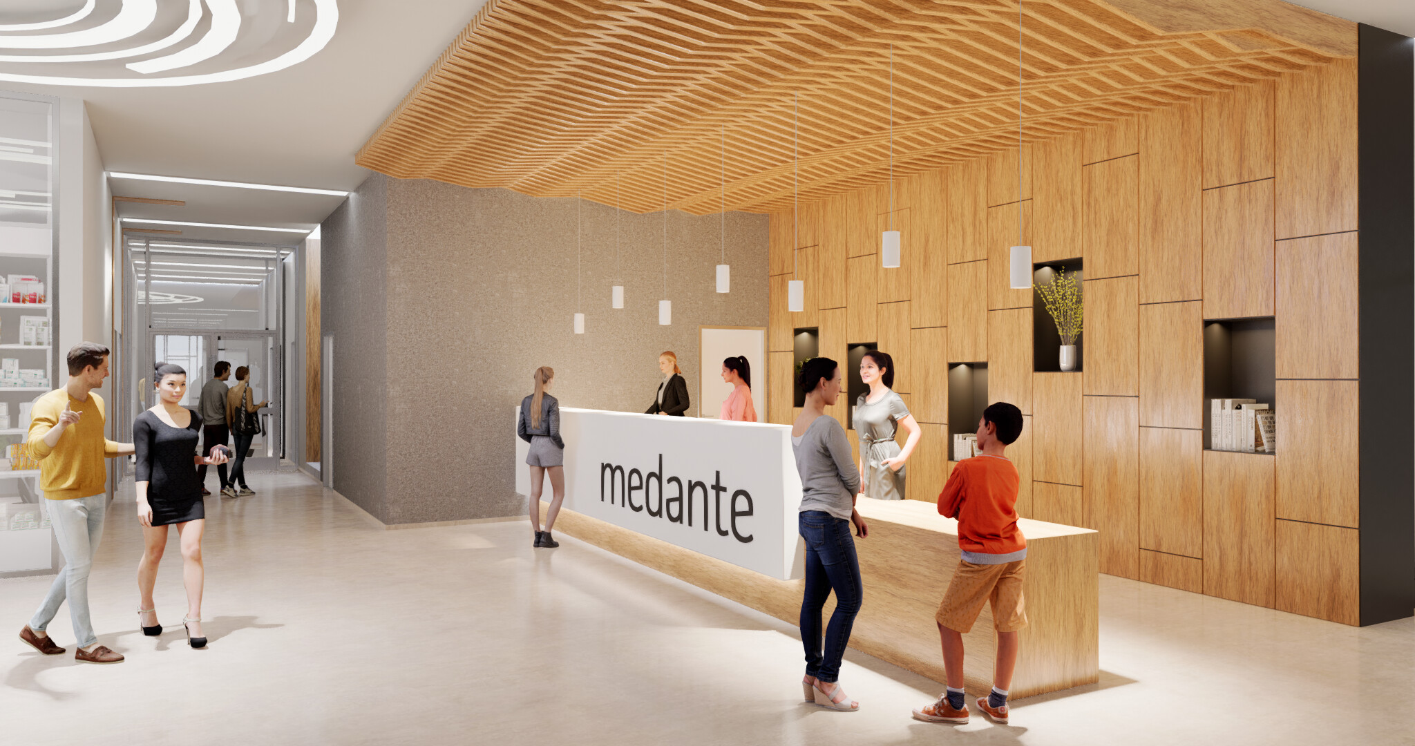
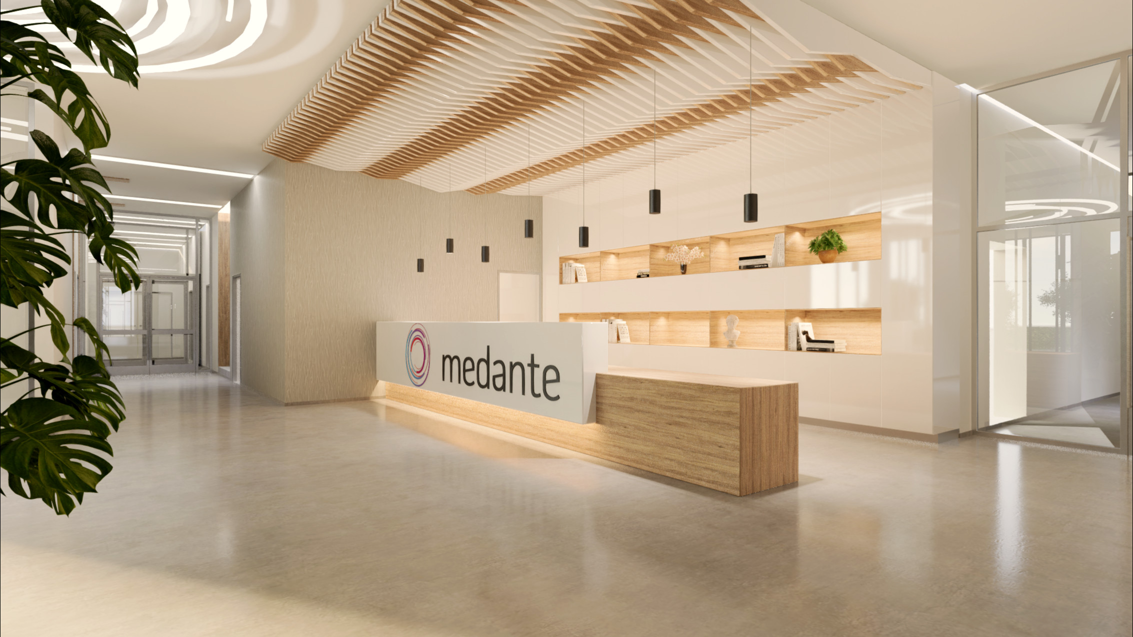
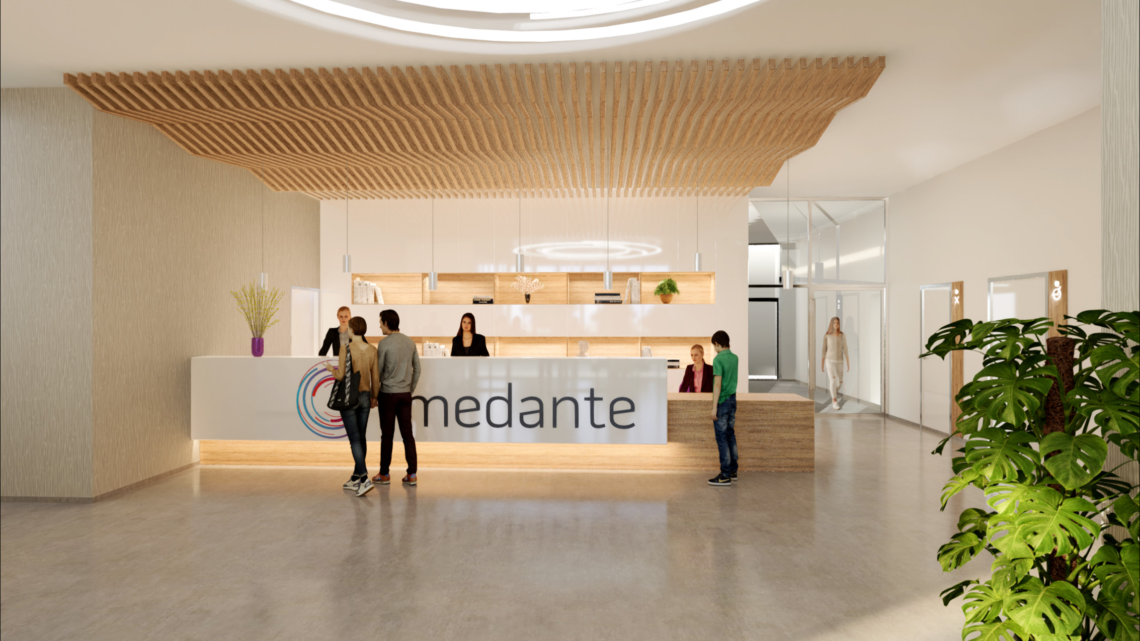
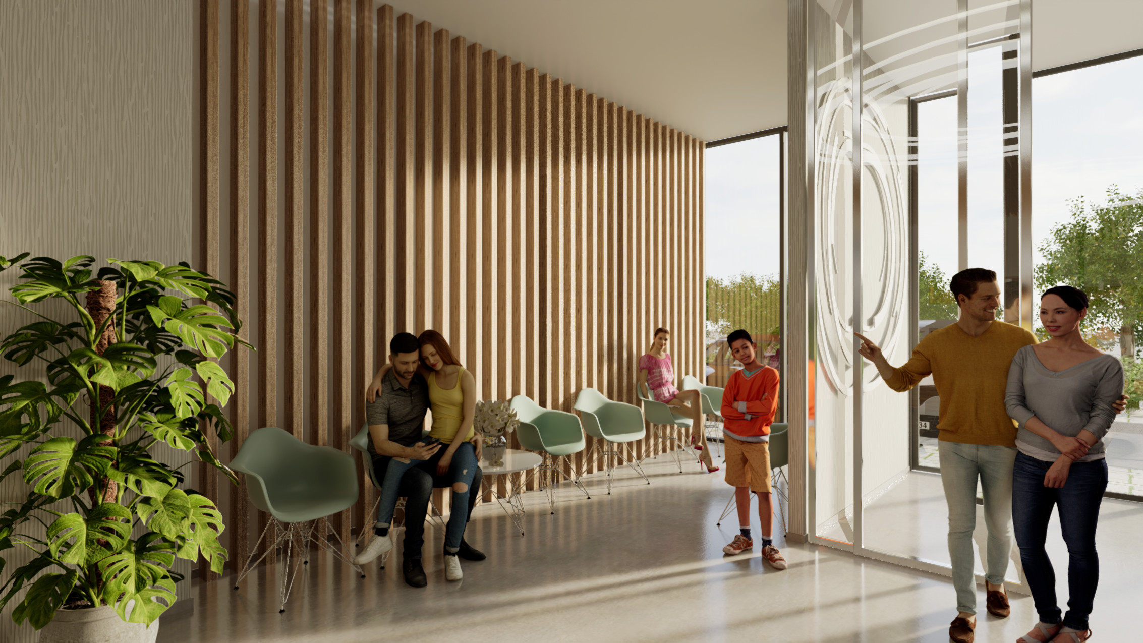
View 1:
-Women behind reception desk too tall. (or the couple in front is out of scale)
-Rotate the couple so they face the receptionist.
-Remove the child.
-Move the walking woman in front of the glass
-Circular lights are faceted. They are circular but also generally have height and only the bottom is lit.
-Rotate slightly and center the camera so is in line with the center of ceiling timber slats
-Less light intensity inside shelves or make its timber slightly darker.
-Door frames look made of silver. If they are steel, make them darker.
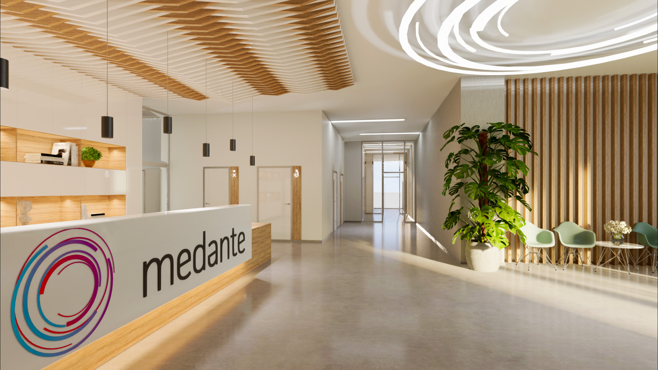
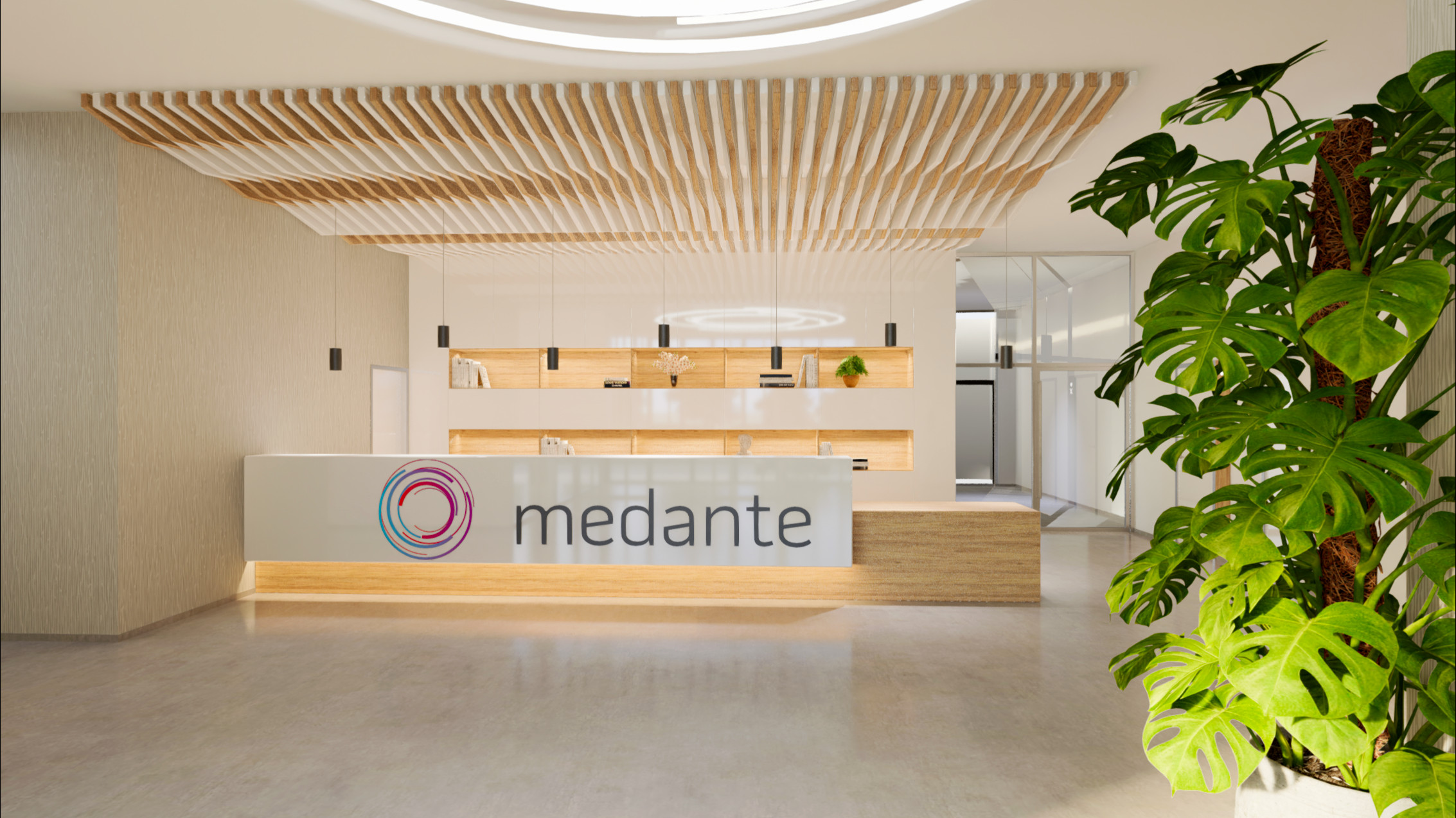
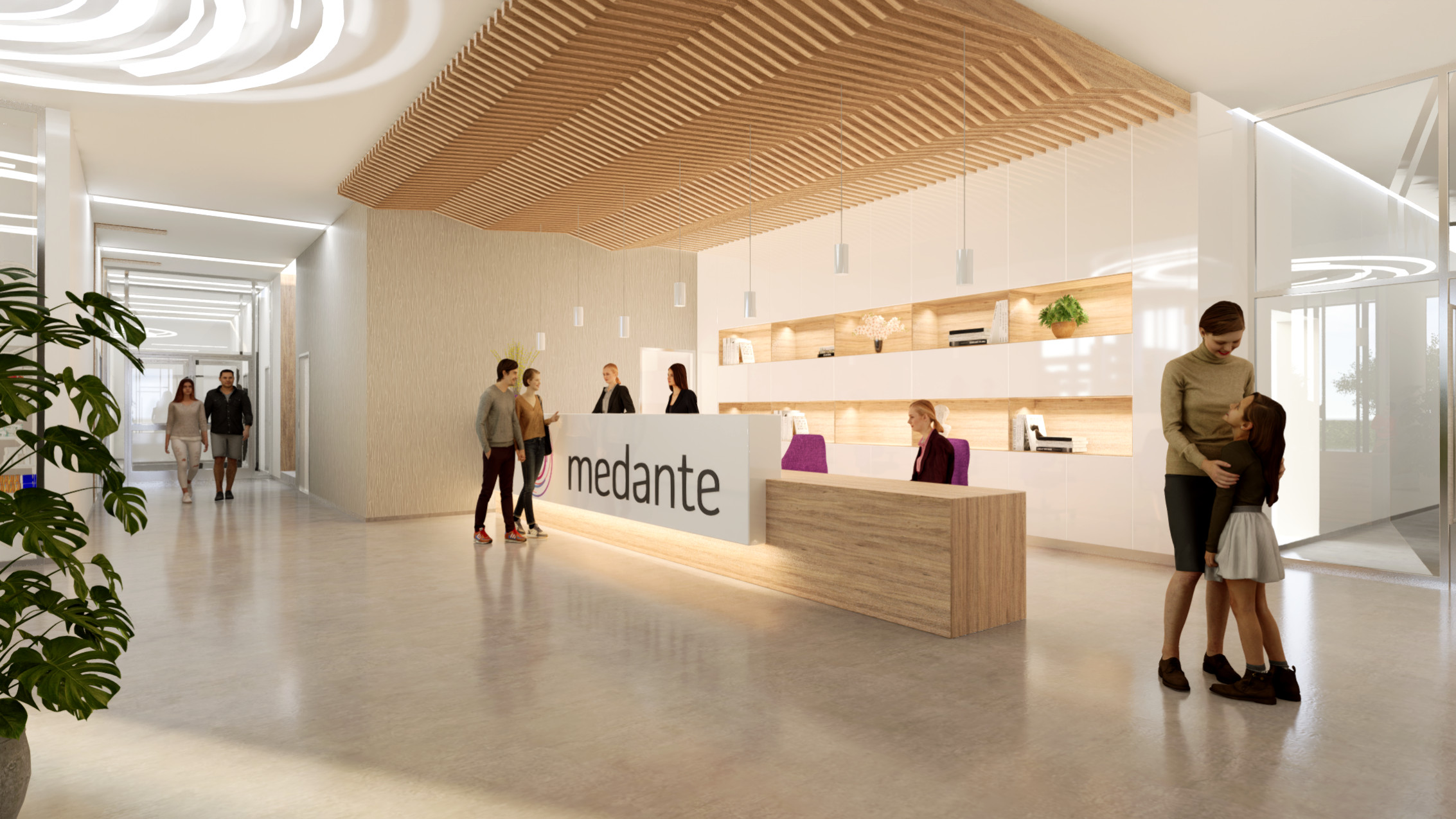
View 2

View 3
-Same comments as above + people don’t look interacting with the receptionist and not facing her. The seating couple attracts too much attention and call for instant distraction as she sits on tops of him.
I would tell them: get a room!
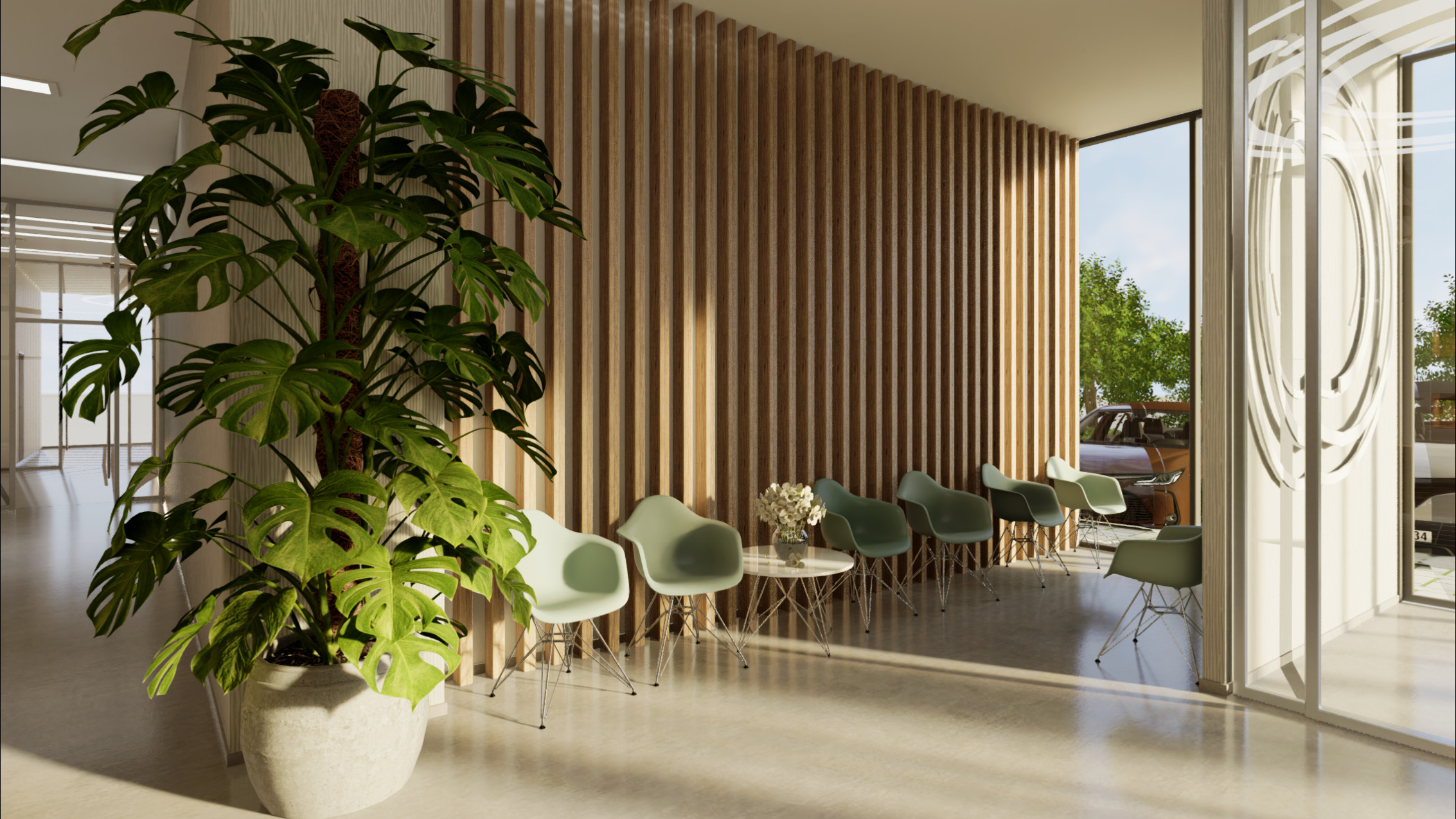
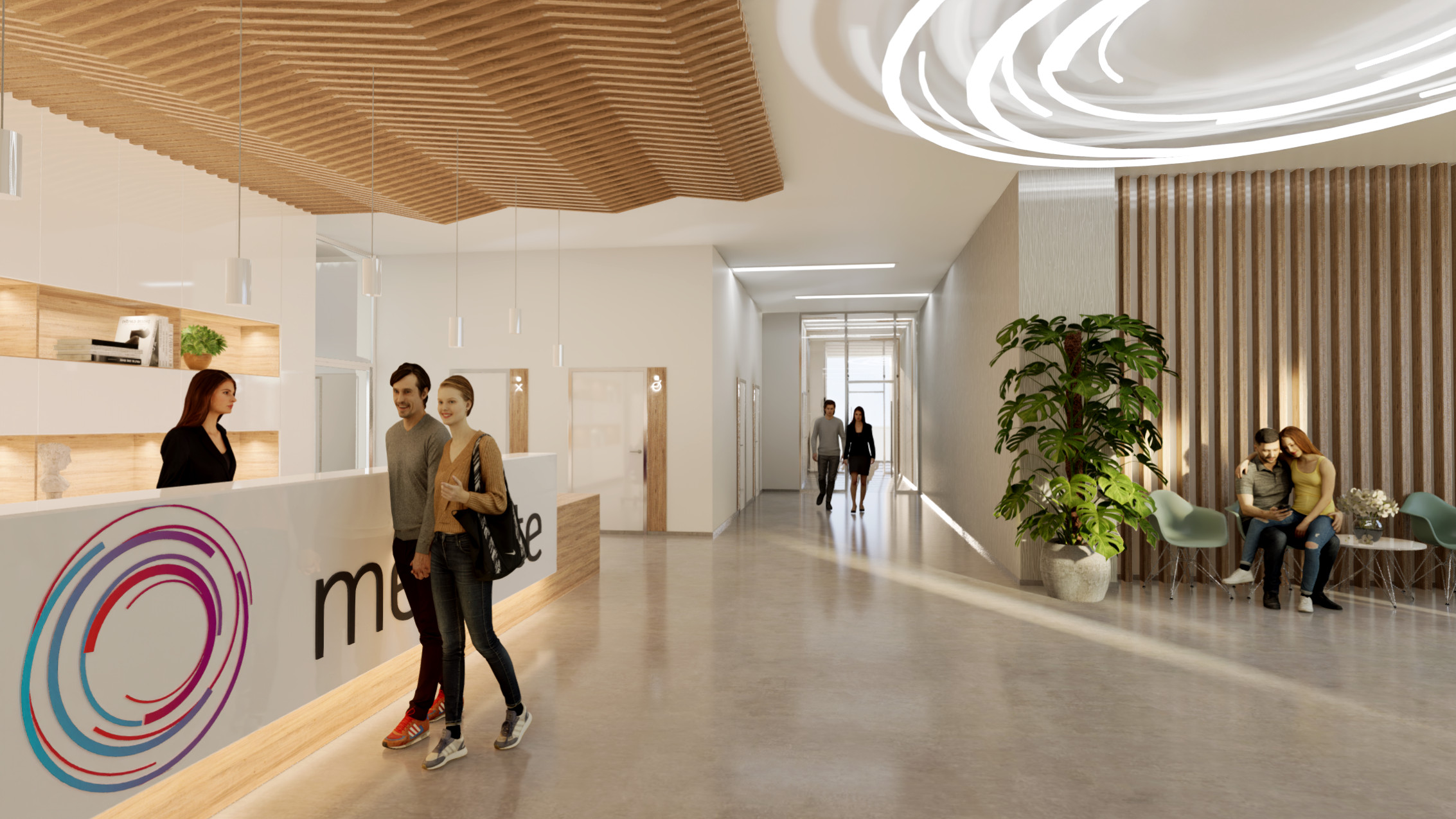
View 4.
Don’t use 3d people unless they are far from the camera. Use photo cutouts for the close ones but in general never put any people close to the camera. It detracts the viewer from what you try to show: interior architecture.
Hope it helps.
dear mate, thanks alot for your detialed info and your effort, Im really glad for all…I will save your words and rework it…thanks alot again
No problem. Pleasure to help if I can. Keep up the good work!