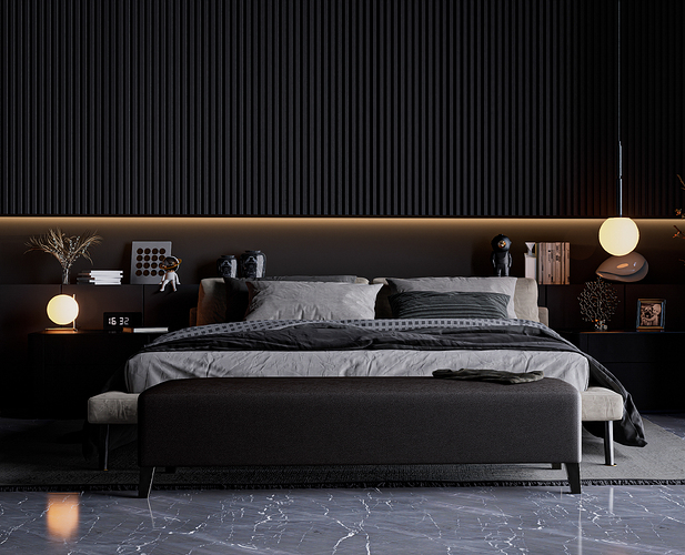
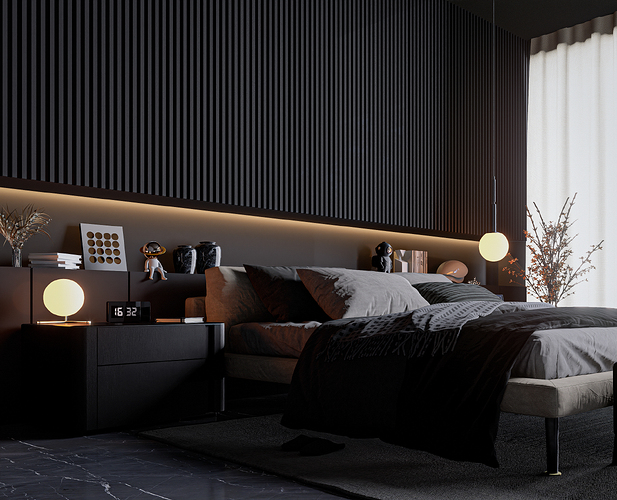
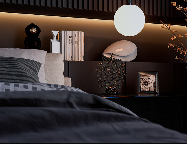
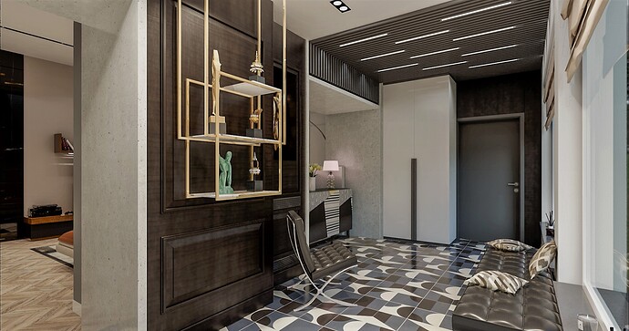
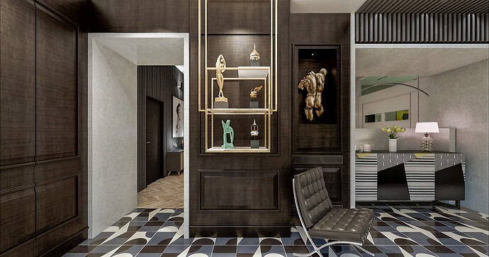
Theme: Men’s bedroom design
[https://www.behance.net/gallery/188661785/Bedroom-Design]
Artist: Ricardo Echeverría
Instagram profile
Graphics Card:
RTX 3070
Workflow:
Revit + D5 Render
Brief description of post-processing:
I retouched the contrast, brightness and color correction of the images in adobe lightroom.
Model source:
Model made from zero, if you want to acquire it, please contact me.
Decorative elements were taken from the D5 gallery.
Description of the work:
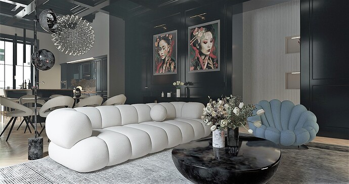
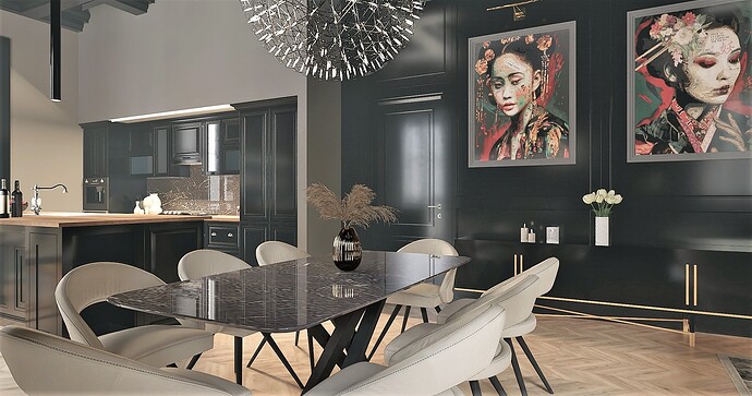
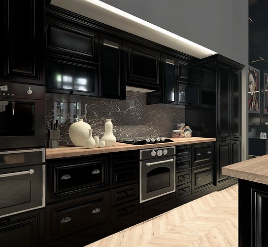
In shaping the design narrative of this interior project, the aesthetics of a discerning gentleman were carefully considered. The compositional strategy focused on the integration of substantial materials accented by dark tones, meticulously chosen to imbue the space with a refined, dignified and elegant character. The selection of these elements reflects a deliberate pursuit of sophistication, ensuring a harmonious synthesis of substance and style.
6 Likes
Hello, I like this comparison that you want to argue, let’s say that you were impeccable in organizing the environment with dark colors and high quality furnishings, a style between minimalist and classic. It is a style, which many colleagues ride, to furnish and propose to our customers, relying on brands of a certain stature such as Minotti, Rimadesio, Desalto, edra etc…
But we also rely on the mastery of the design of the craftsmen, that of hiding doors and doors of wardrobes, such as the headboard of the bed you designed, which in my opinion, seems that the ribbed one with the light black color that goes to dark gray, is a wardrobe with doors that cannot be glimpsed that have the function of hiding, blankets and pillows. It has not only an architectural impact to beautify the environment, but also a functionality, with the niche that runs along the entire bed giving the possibility both to illuminate that area but also to support it.
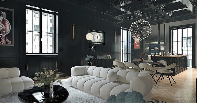
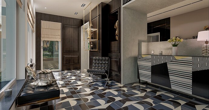
I think it’s not easy to manage the environment with dark colors, the customer may like it or not, but done well, it catches the eye. The black color, especially when you have to make a render is difficult to manage and give the effect you wanted, I post one of my projects made in the past with D5 2.4 and 2.5 :
I hope you liked my comment that you asked me, and I appreciate this type of discussion between colleagues, also to broaden the architectural vision of an environment, to collect ideas and thoughts.
Greetings, it’s Good Job
Sorry for the English
1 Like
Thanks for your accurate point of view, I share some of the ideas you brought up. Stunning images, the level of detail shows your expertise.
1 Like
