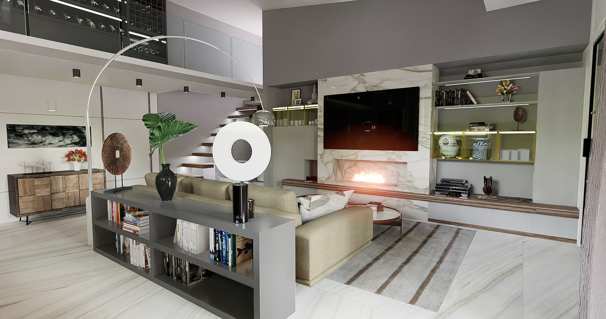
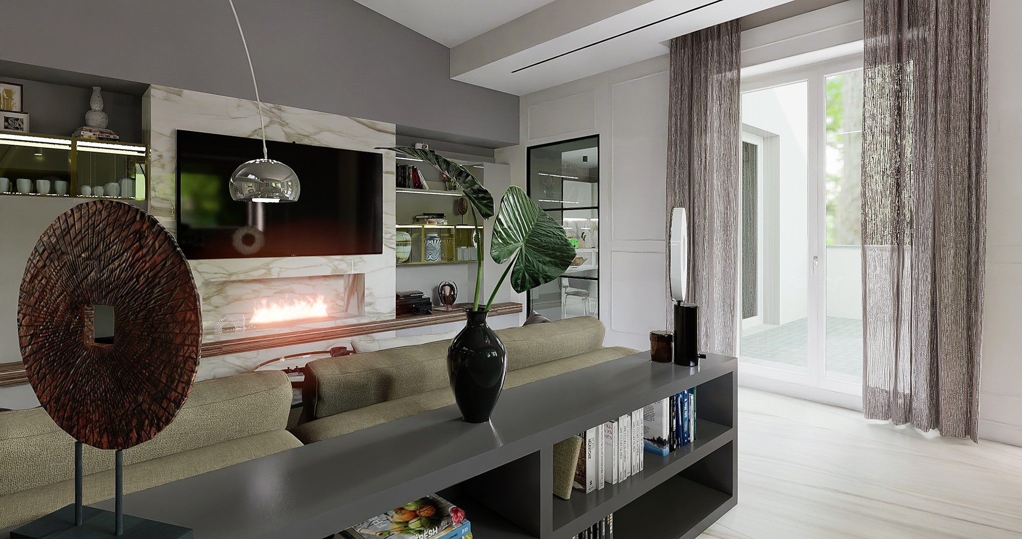
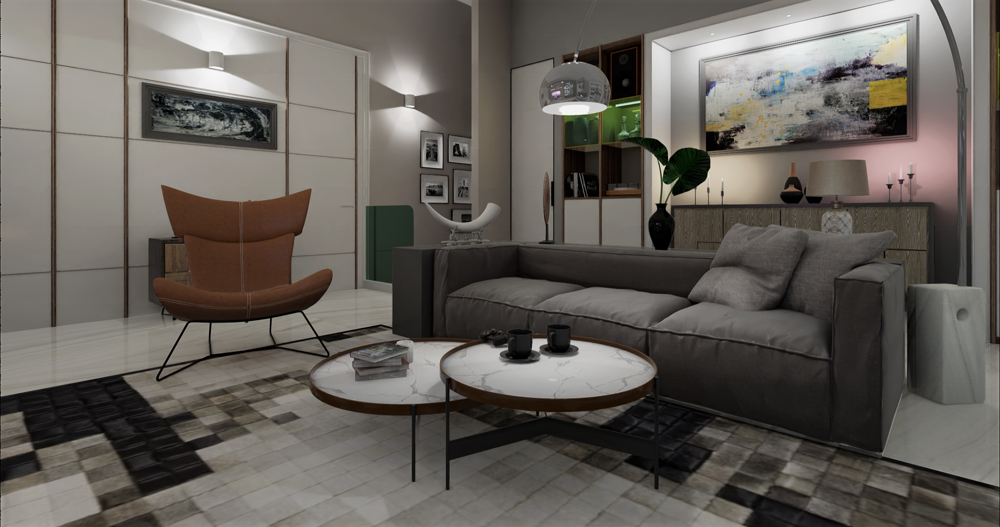
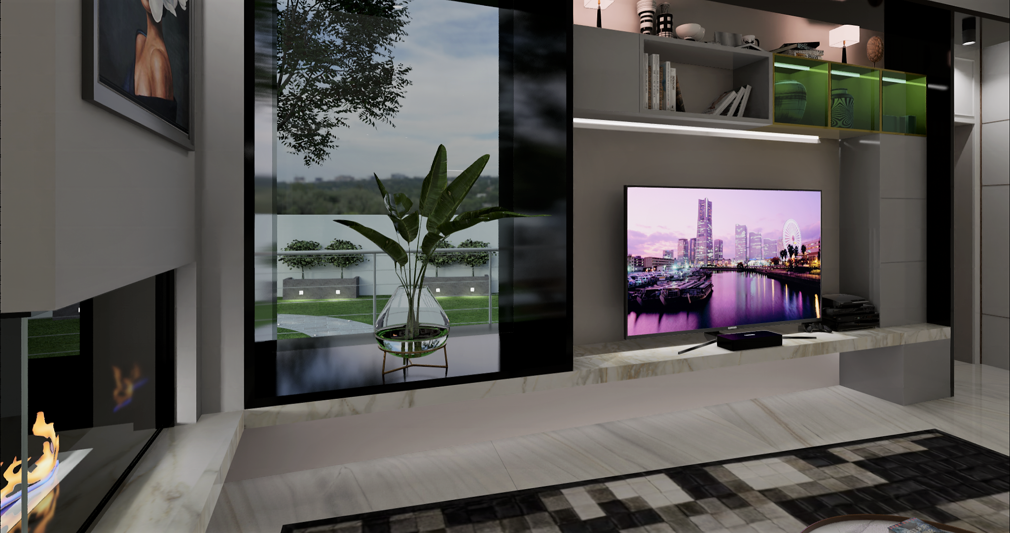
Theme: Living Room Puozzuoli
Artist: DIFOCA GROUP ARC
Graphics Card: 1070 GTX 16G
5 Likes
Ciao Sergey
Thanks so much for your support ![]()
![]()
![]()
Ciao Oscar.z
Thanks so much for your support ![]()
![]()
![]()
Ciao ngodienvu
Thanks so much for your support ![]()
![]()
![]()
Oliver Thanks so much for your support ![]()
![]()
![]()
![]()
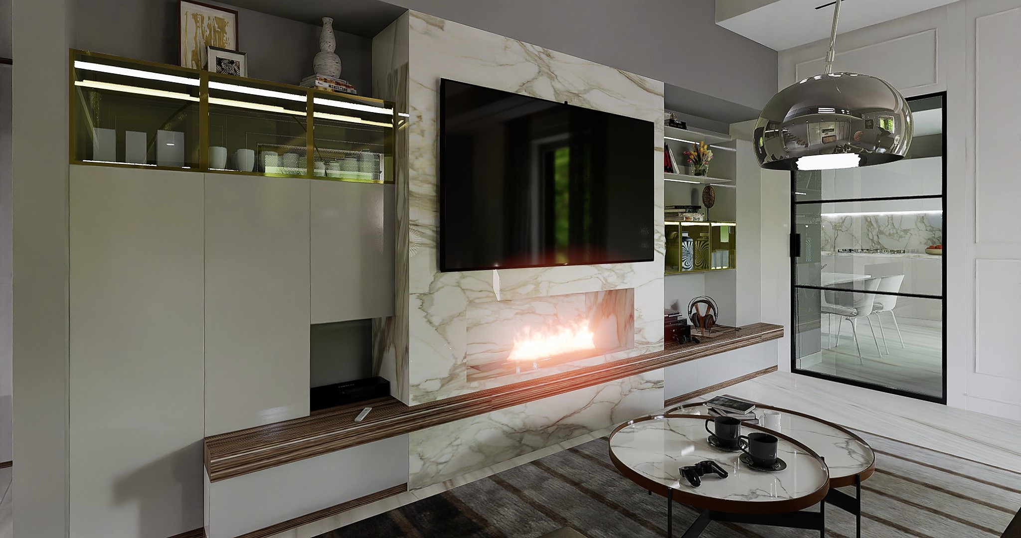
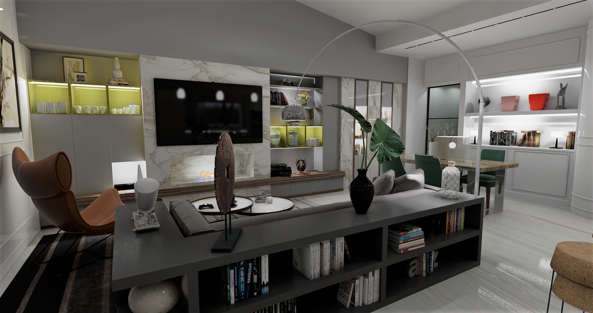
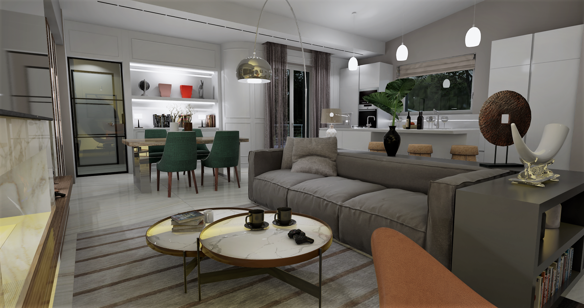
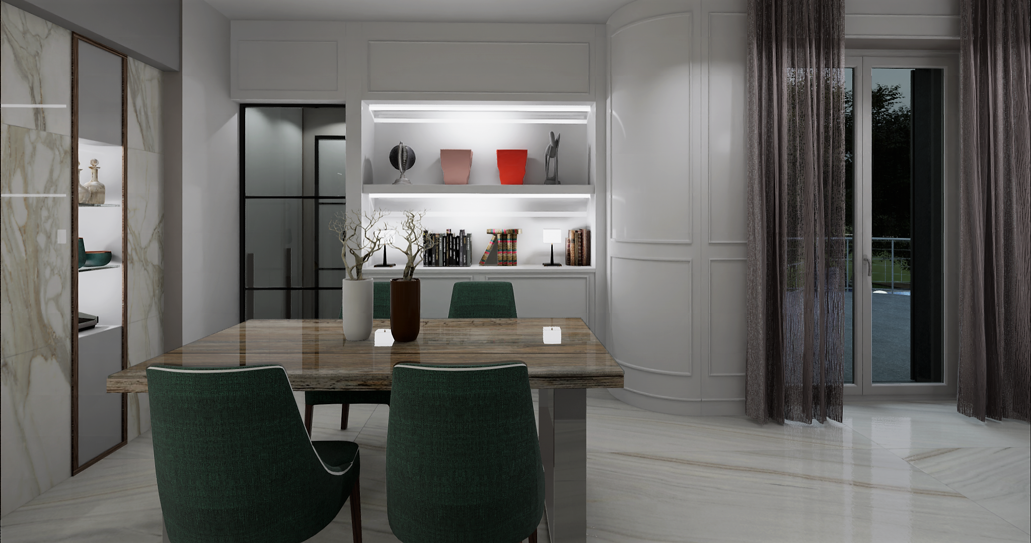
It’s a quality model carefully rendered but I think there is too much light. House & Garden and Metropolitan Home magazines used to photograph interiors using mostly natural light. The result was that their interior images had a lot of mood and depth. I think all of the light flattens the images and creates hot spots. Particularly in the image with the large window, why not rely on the outside light to light most of the scene? Letting the light naturally fall off gently will create areas of focus, while allowing other areas to recede.
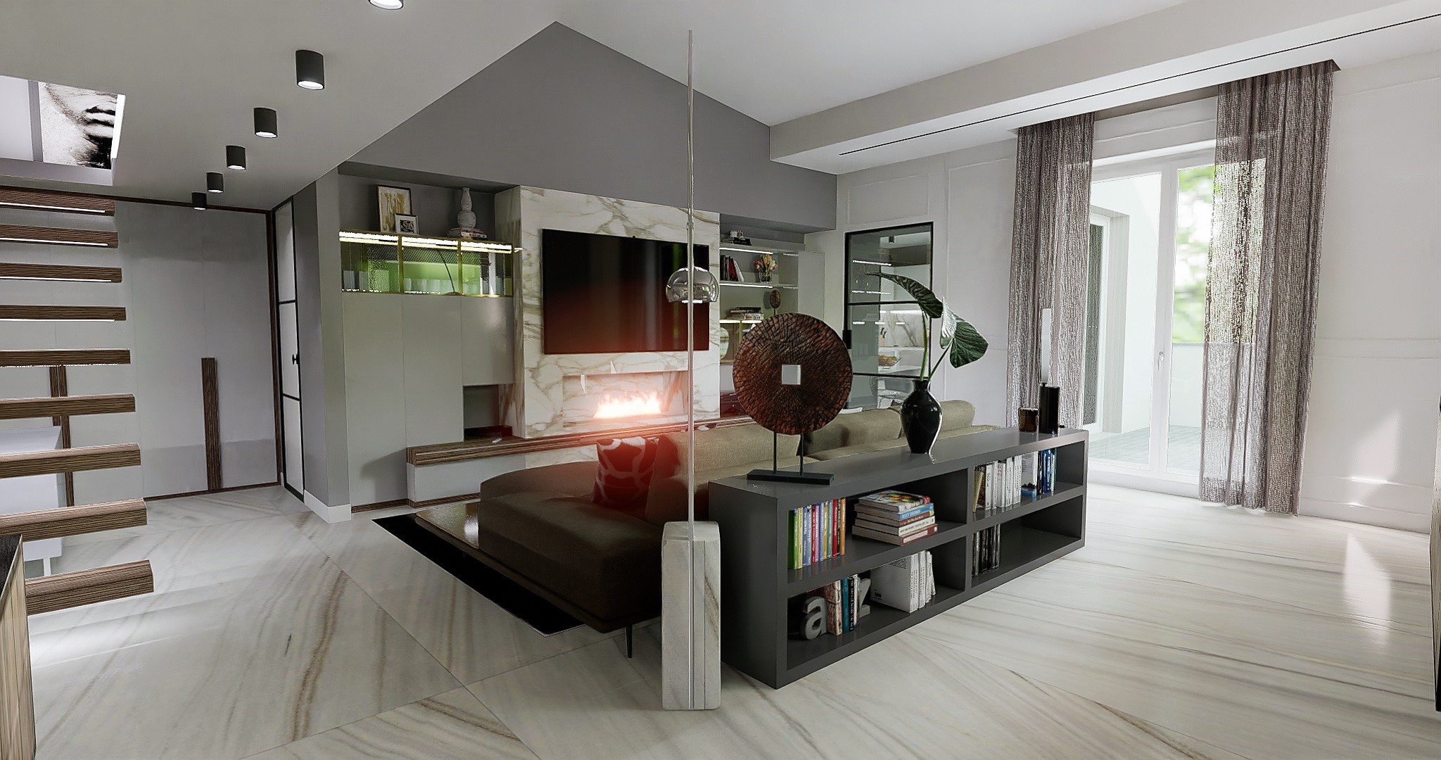
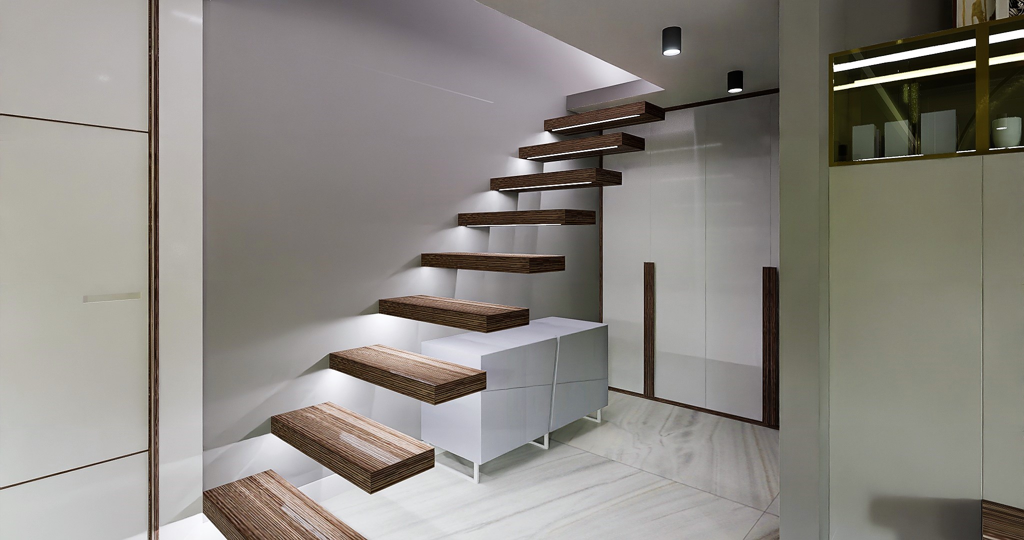
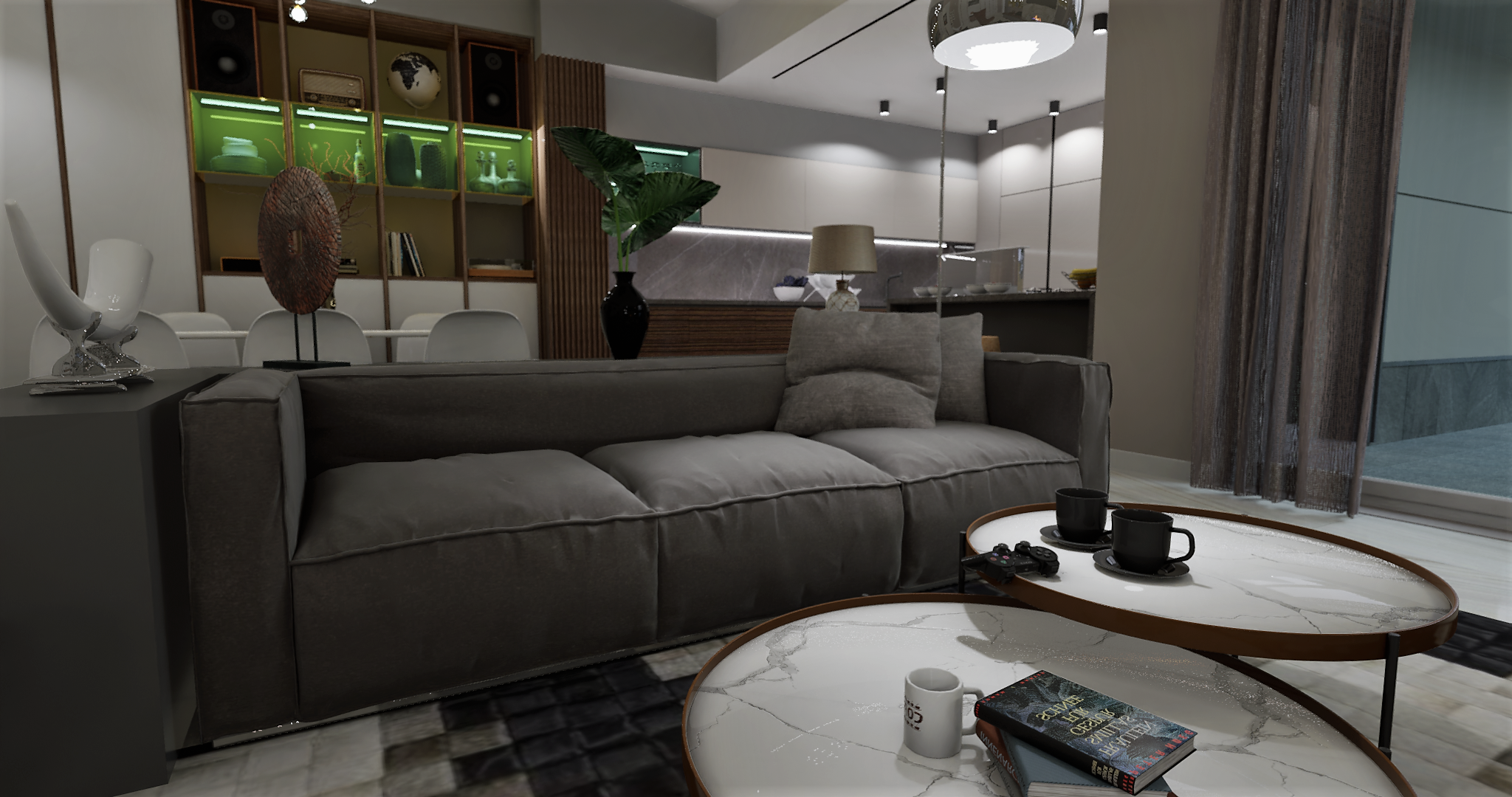
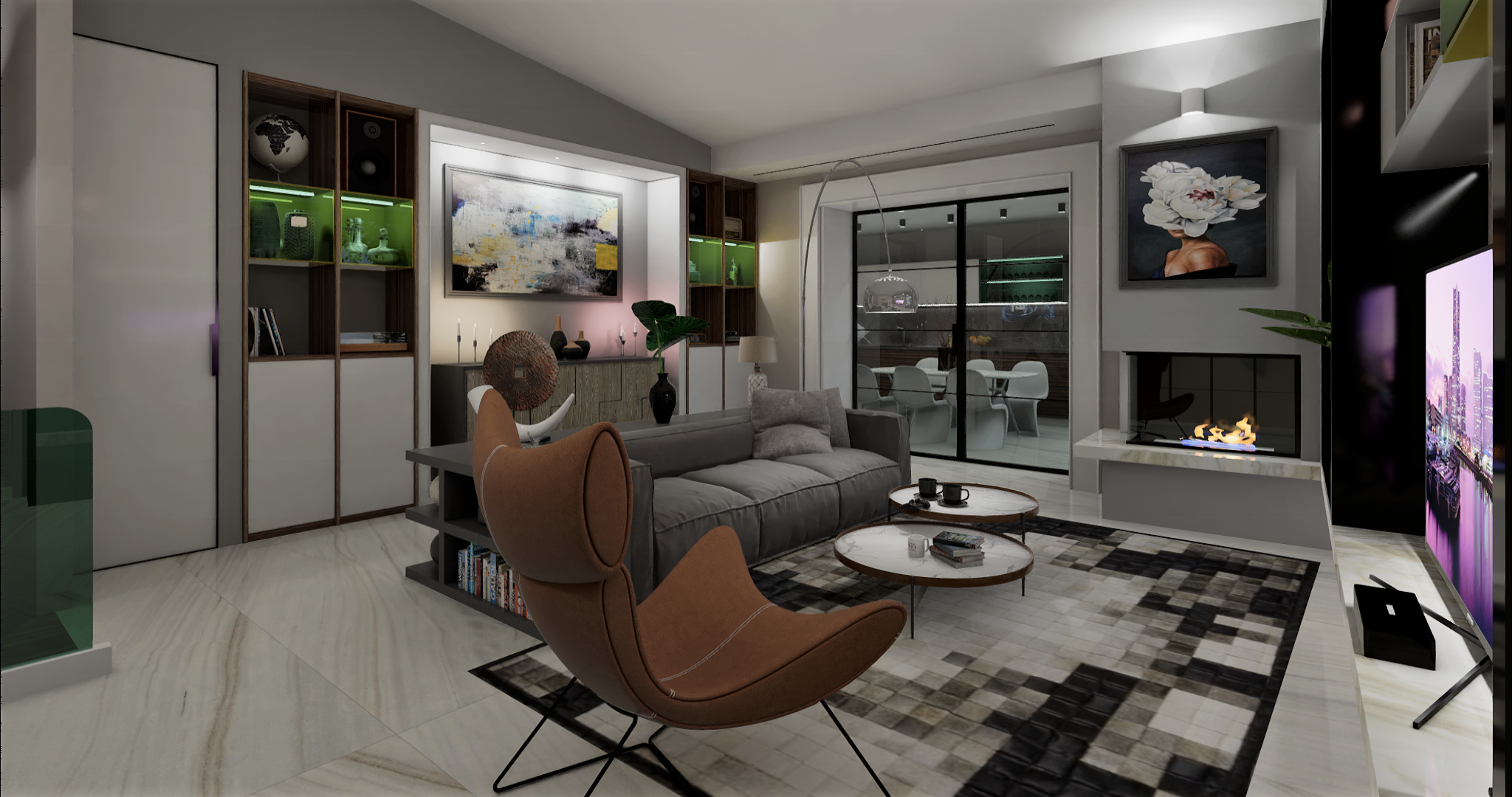
You are right, some clients criticized me because in the images I showed them nothing could be seen, and then they wanted to see the environment with artificial lighting. I had to adapt, there is always a compromise between the client and the professional. Now I show you the continuous evolution, only of that room, which I had to do so many times.


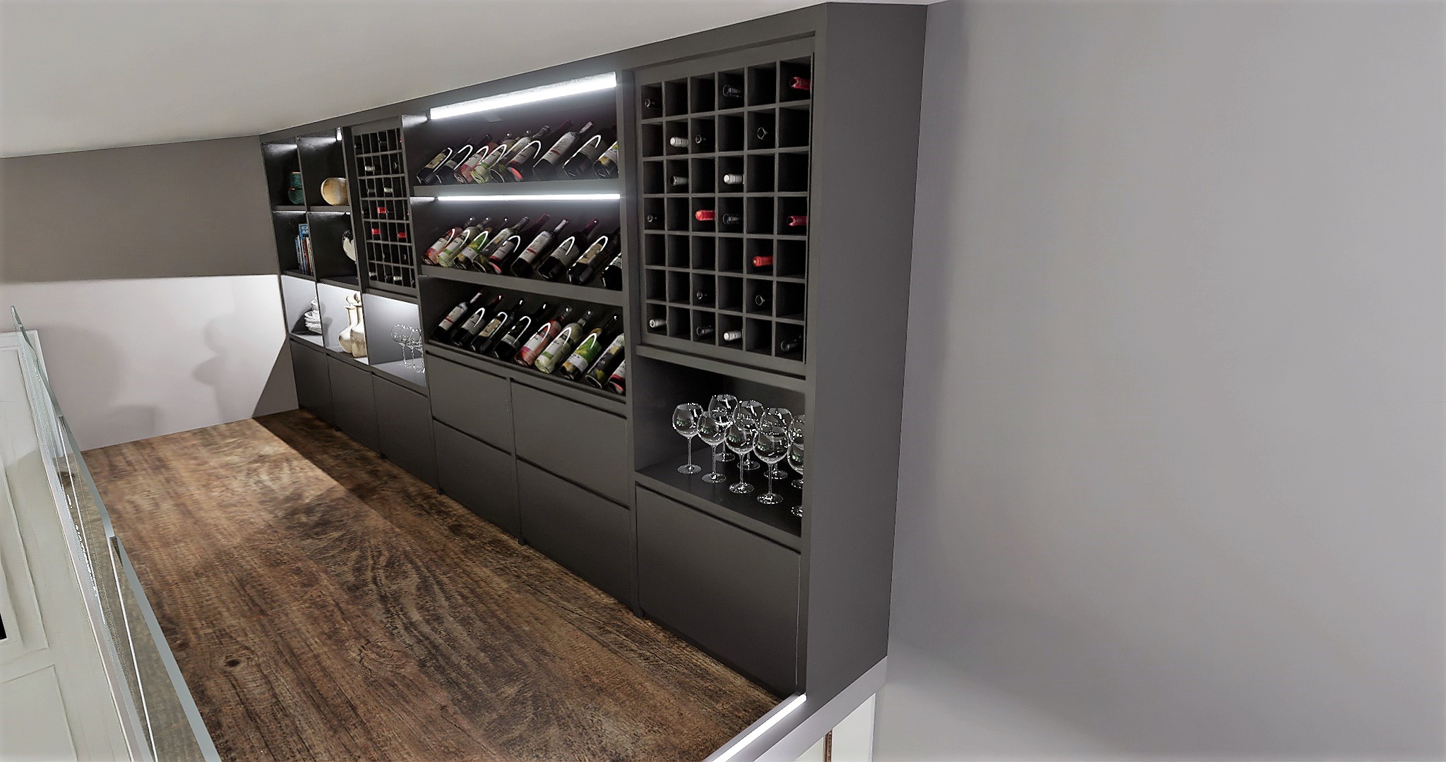
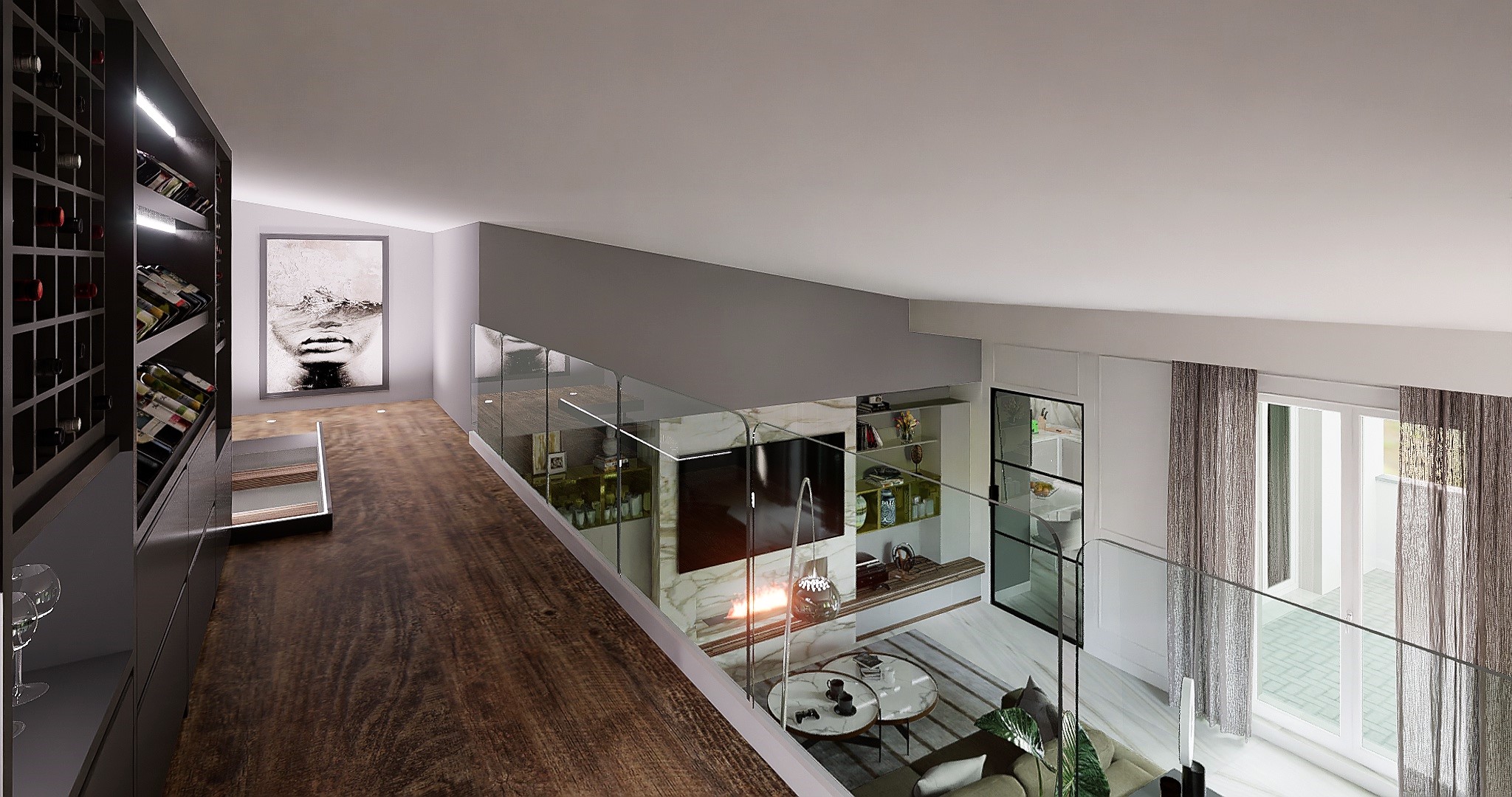
And so on, in the end I arrived at the 12th room, and then I made everything else with the exterior of the villa.
It was tiring and stressful, but still beautiful and satisfying.
The pictures I posted and of the previous version when I was not a PRO
Anyway, thank you for your observation
Well, if it’s client driven, then there’s that. The latter images do look very much like night time lighting. I think you might get a better result if you warm the lighting to an equivalent of 2700K. The white light (3000K +) makes the images look a bit too corporate. And would you really try to light the flames in a fireplace?