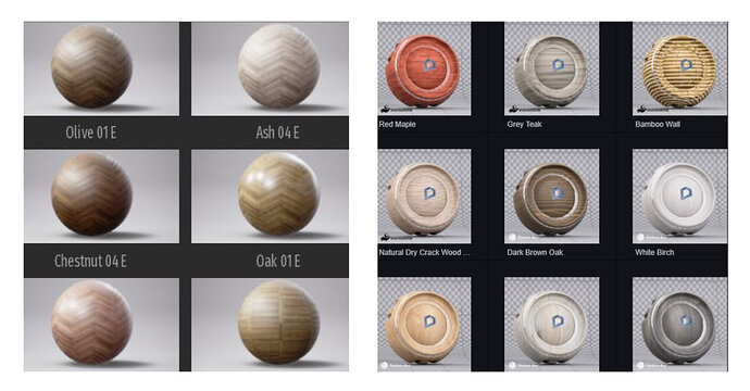
The left image looks better for preview material as it is simple, plain, and easily readable. Whereas, the right (D5) has tiny maps which are even harder to read on such a bumpy model. Please change it to a plain sphere with no ‘D’ sign on it. Thank you
5 Likes
Hi there,
You’re right, we’ve finished development of it and will probably be released by the end of the year.
1 Like
