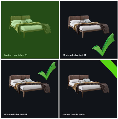
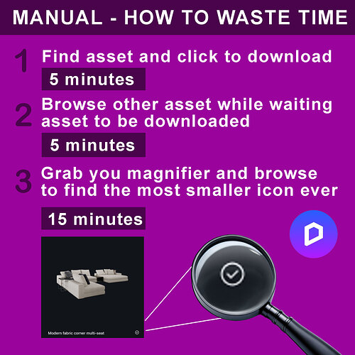
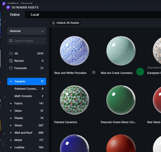
the icon that mentionne asset is downloaded is way too small, i posted many times on facebook, so many users agree with me. We, users dont have the assets on our computer ( please dont tell me to add to local ), sometimes, many time, asset take time, do you think we wait ? no we browse other asset to have a look then we have to find that ridiculous icon, why is it the size of an ant, do you know how challenging is to find this ridiculous icon ? So easy to do, yet d5 doesnt care about users feedback anymore, it’s already an hassle to have to deal with online assets, why dont you fix this easy bug and at the same time making amazing progress, i dont get it, i have already mentionned this problem to Luna Lung so many time, Olivier Jure too. Here is my suggestion, something that make downloaded item easy to find.
I only like the above proposals in the left uppercorner and the right undercorner
it was just an example, really doesnt matter as long as it is clearly visible when we scroll back, can be a green dot, a green outline, whatever that just instantly jump to the eye, how such a good software can produce such a ridiculous icon, it’s so annoying but now, they dont give a shit anymore about feedback.
I’m struggling with the same problem.
Finding an already downloaded item/asset is a pain in the a**.
A clearer indication of which item is already locally downloaded is a must-have. I think the best thing would be to change the thumbnail color to something else (even light gray would be enough). And/or add a function to filter assets and sort them. Add a “downloaded/local” category to the existing “favorite”, “free only”.
they dont give a shit about customer feedback anymore, even just make this stupid icon green color, they dont do it, i finish my year subscription and move out.
Possible not enough votes of people in the idea and request. (Is it placed there)
Some other ideas with around 200 votes is also not yet in the software.
i only posted in forum and fb, many users agree, the point is changing this to a green dot, or a green checkmark is not difficult, 1 line of programming, done
Without on correct sub forum. Team will not see it correctly. Including other users.il will not place it there because it is your idea.
i put in ideas & suggestion, hope it goes through, just making the icon green or round shape is a 5 minutes job for a programmer.
change the download icon to something that we can find easily, it’s very easy to do yet, d5 dont give a shit even many users agree on the stupid ridiculous size. 2.9 is out and yet, have to struggle to find this stupid icon !
Hi there, I apologise for this experience, I’ll relay your feedback to the team. Hopefully there will be improvements in the future. I recommend posting this suggestion in the ideas and request section so other users can contribute.
Thanks
exactly…
I always wanted to run atopic for it but though maybe no one has the same problem
Also, the mono-color asset library(and other menus) causes lots of confusion. Dark grey/light grey is tough to use,
sometime, asset dont download right away, we then, scroll other asset to have a look, then, we enter in hell to find a microscopic ridiculous icon, very hard to find, make it green dot, or check mark, something easy to spot when scrolling. This is 5 minutes job for a programmer.
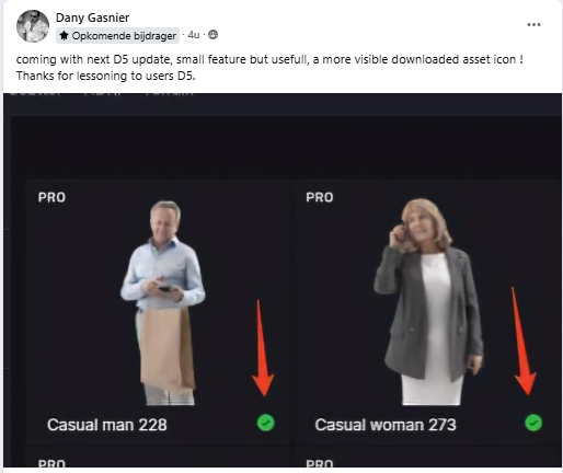
they did change something!


